INDUSTRY:
MARKETPLACE IoT
CLIENT:
TELECOM ITALIA SpA
YEAR:
2022
TIMELINE
3 MONTHS
UX Strategy for TIM’s IoT Product Platform
A strategic redesign of TIM’s IoT commercial platform — improving usability, information architecture, and lead generation across 52 screens in under 90 hours.
A strategic redesign of TIM’s IoT commercial platform — improving usability, information architecture, and lead generation across 52 screens in under 90 hours.
A strategic redesign of TIM’s IoT commercial platform — improving usability, information architecture, and lead generation across 52 screens in under 90 hours.
project overview.
The TIM IoT Marketplace was originally treated by stakeholders as a conventional e-commerce platform, though in practice, users could not directly purchase products. Instead, the site functioned as a product showcase, where potential clients explored IoT solutions and submitted contact forms to express interest.
This misalignment between business goals and platform functionality led to confusion in both communication and UX.
My main challenge was to reposition the platform as a lead-generation tool, not an online store, and redesign its structure accordingly.
role & scope.
I redefined the site's UX by:
Clarifying the platform’s role as a discovery and inquiry tool rather than a direct sales channel.
Restructuring navigation and product presentation to highlight solutions and guide users naturally toward form submission.
Simplifying informational content to align with user mental models and business objectives.
Creating a lead-oriented user journey, emphasizing value proposition and making contact actions intuitive and accessible.
The result was a strategic redesign that realigned business and user needs, transforming the platform from a misused e-commerce structure into a purpose-built lead acquisition channel.
The result was a strategic redesign that realigned business and user needs, transforming the platform from a misused e-commerce structure into a purpose-built lead acquisition channel.
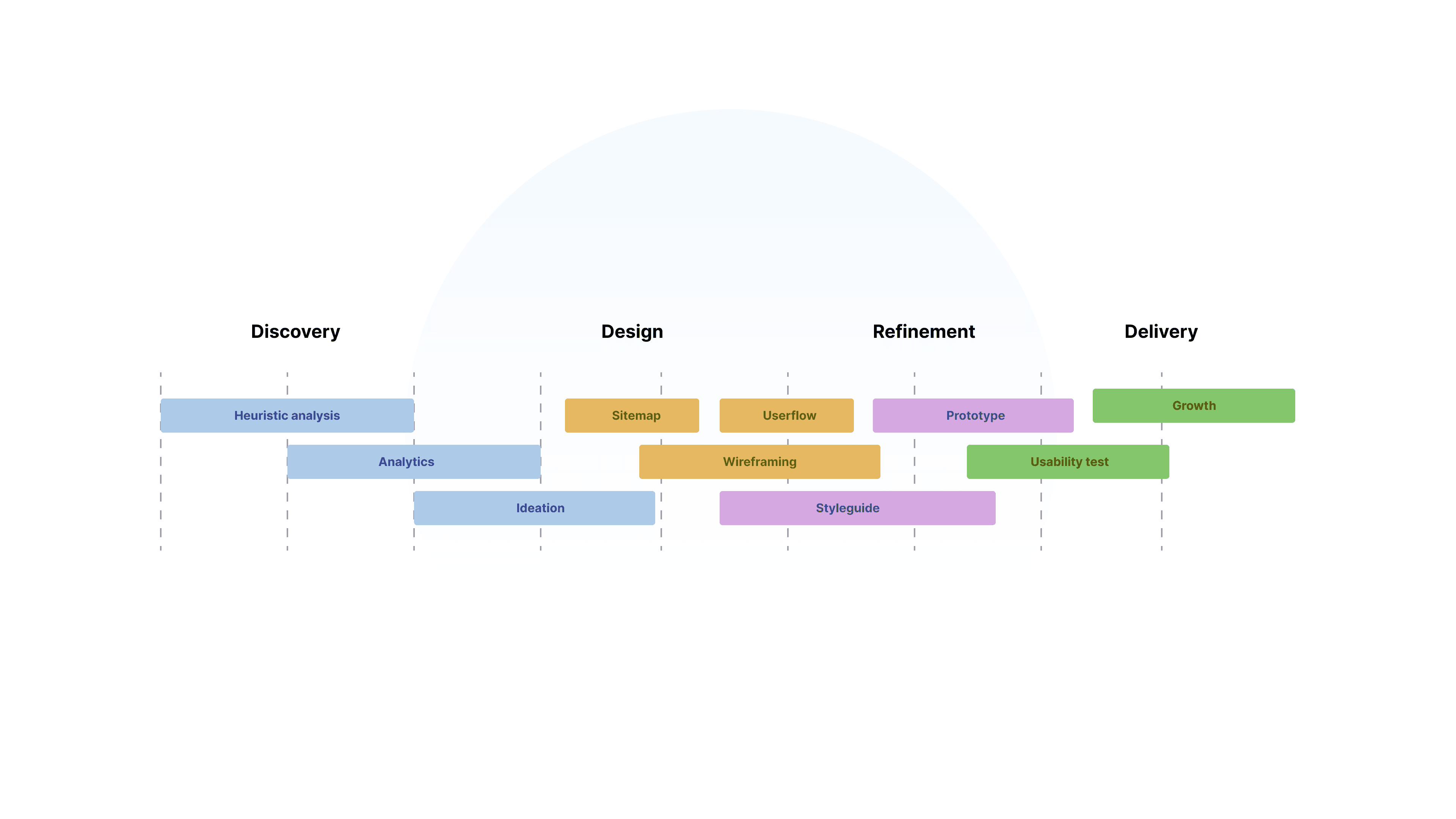
methodology.
Given the short deadline, the process was designed to be both strategic and highly pragmatic. I began with a desk research phase, combined with a heuristic analysis of the existing website. The goal was to quickly understand not just usability issues, but also the underlying disconnect between business expectations and the actual platform experience.
What I did:
• Heuristic analysis and analytics review
• Weekly stakeholder workshops
• Sitemap restructuring and user flow mapping
• Modular component design for rapid development
• Usability testing and feedback integration
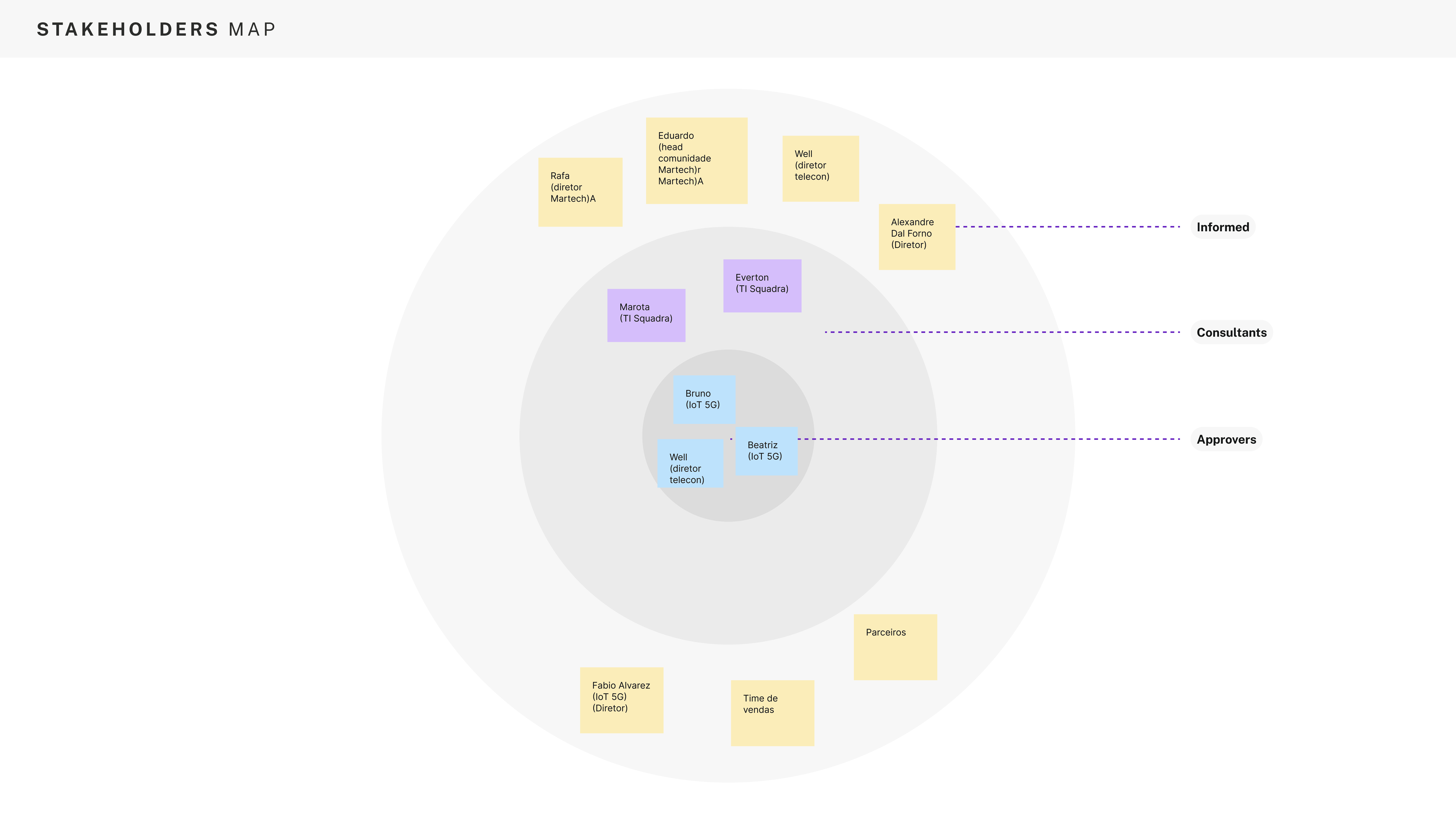
From the start, strategic alignment with stakeholders was crucial. Through weekly workshops, we defined key priorities: What mattered to the business? What mattered to the end user? And most importantly, what were we trying to achieve with this redesign? In this case, the problem was already clear: the website wasn't functioning effectively as a lead generation tool. There had been no significant growth in IoT solution inquiries over the past semester, signaling that the existing experience was failing both the business and its customers.
With this alignment in place, I had the freedom to take ownership of the UI design. Since the platform was being rebuilt in WordPress, I adopted a component-based design approach, creating modular UI elements to streamline development and facilitate future scalability.
Each phase lasted 2–4 weeks, with weekly updates and approvals to minimize misalignments and delays.
design strategy.
• Created a modular system of interface components to ensure efficiency across 52 screens
• Unified typography, color, and layout rules under a simple visual language
• Optimized for mobile responsiveness and performance across CMS platforms
• Introduced CMS-friendly design for future scalability
improvements.
• Simplified homepage value proposition
• Fixed critical contrast issues in hero sections
• Organized services by solution category for faster browsing
• Replaced shopping cart simulation with a smart contact form
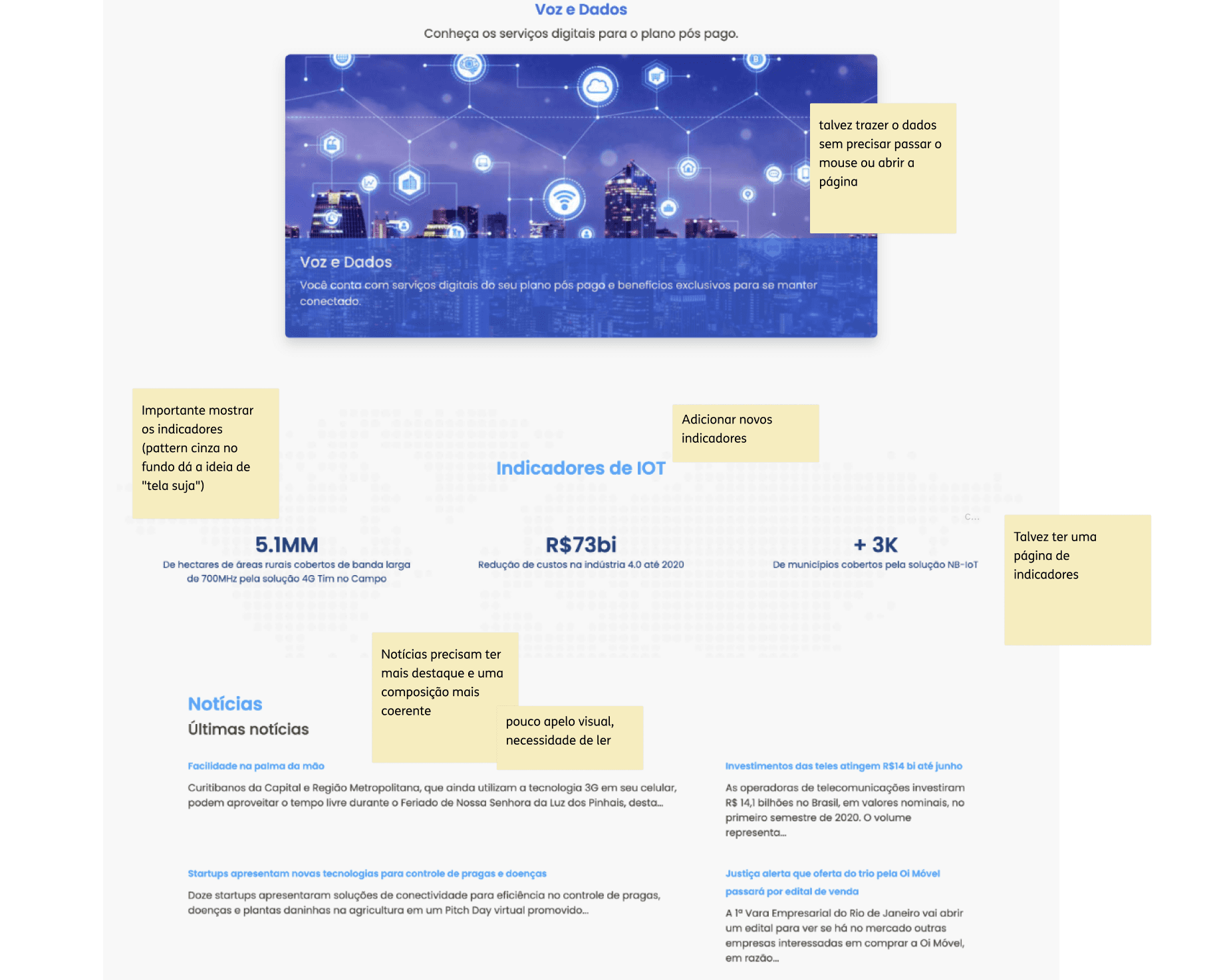
before.
Key Issues Identified in the Original Website
Visual Confusion Between Solution Categories
The verticals' cards did not clearly differentiate between business areas, leading users to mistakenly assume that all other solutions were grouped under the Agribusiness category.
Information Order Didn’t Prioritize User Understanding
Inside each vertical’s page, solutions were displayed before explaining what that vertical offered. This prevented users from understanding the context before viewing the solutions.
Weak Visual Hierarchy and Composition
The interface lacked a clear visual hierarchy, especially in the card layouts. The combination of icons, images, and text composition was inconsistent, making content harder to scan and read.
Tabs Appeared Inactive
The tabs looked visually inactive or disabled, confusing users about what content was available.
Solution applied: restructuring the content to display information in multiple sections at once, reducing over-reliance on tabbed navigation.
Indicators and News Lacked Visual Emphasis
Important indicators and industry updates were visually hidden or understated. These strategic elements needed stronger visual appeal to capture attention and communicate value effectively.
after.
Clear Separation of Solution Categories
Each business vertical was visually distinguished through improved card composition and clearer labeling, eliminating confusion between product segments.
Content Order Focused on Clarity
Vertical landing pages were restructured to first present a clear description of the segment, followed by relevant solutions—helping users understand context before engaging with options.
Improved Visual Hierarchy and Composition
A consistent combination of icons and imagery was introduced to create a balanced, scannable layout. Text hierarchy was optimized for readability, guiding the user naturally through each section.
Simplified Navigation Without Inactive Tabs
Information previously hidden behind tabs was reorganized to display in multiple sections simultaneously, avoiding the perception of inactive elements and improving content discoverability.
Strategic Emphasis on Indicators and News
Key business indicators, updates, and news were given visual priority through improved layout composition and stronger visual elements—transforming them into focal points that reinforced value and credibility.
sitemap redesign.
The original navigation failed to guide users effectively through the IoT product offerings. We rebuilt the sitemap to surface value propositions earlier, reorganized content by business segment, and implemented contextual CTAs to encourage exploration.
capturing leads.
By improving layout clarity and restructuring key conversion points (like replacing the confusing cart flow with a clear contact form), we enhanced lead capture while setting more realistic user expectations.
capturing
leads.
By improving layout clarity and restructuring key conversion points (like replacing the confusing cart flow with a clear contact form), we enhanced lead capture while setting more realistic user expectations.
capturing
leads.
By improving layout clarity and restructuring key conversion points (like replacing the confusing cart flow with a clear contact form), we enhanced lead capture while setting more realistic user expectations.
usability & clarity.
Content was rewritten and reorganized into meaningful categories, using concise copy and consistent cards to reduce cognitive load and make the interface more intuitive across all verticals.
usability & clarity.
Content was rewritten and reorganized into meaningful categories, using concise copy and consistent cards to reduce cognitive load and make the interface more intuitive across all verticals.
usability & clarity.
Content was rewritten and reorganized into meaningful categories, using concise copy and consistent cards to reduce cognitive load and make the interface more intuitive across all verticals.


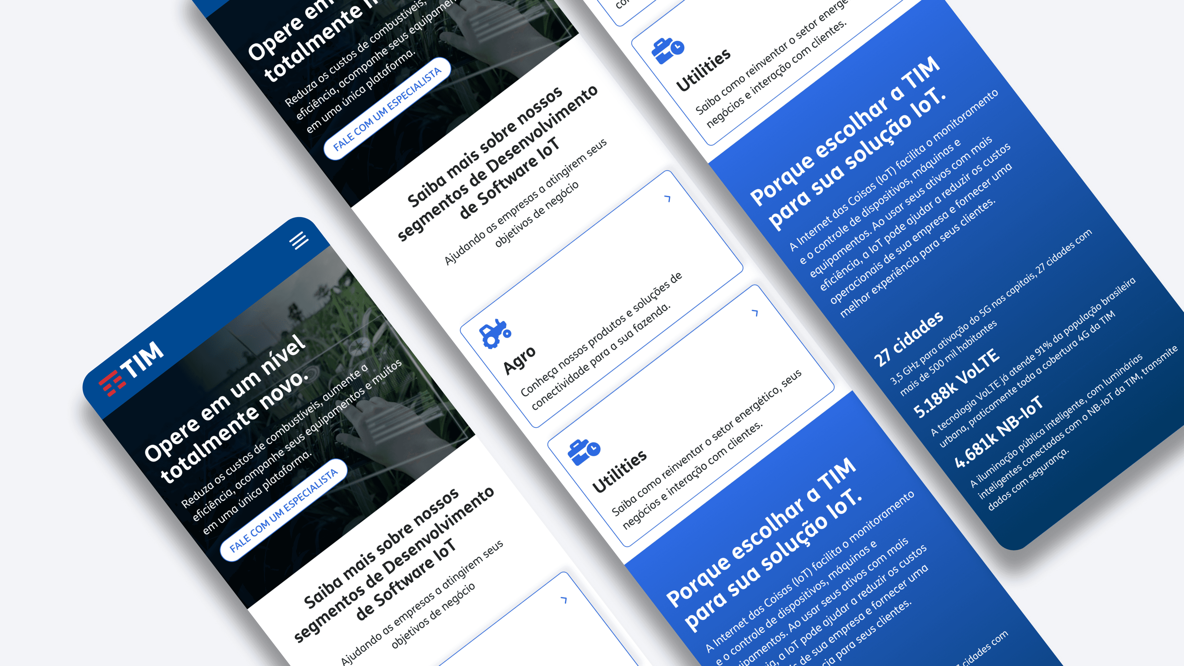
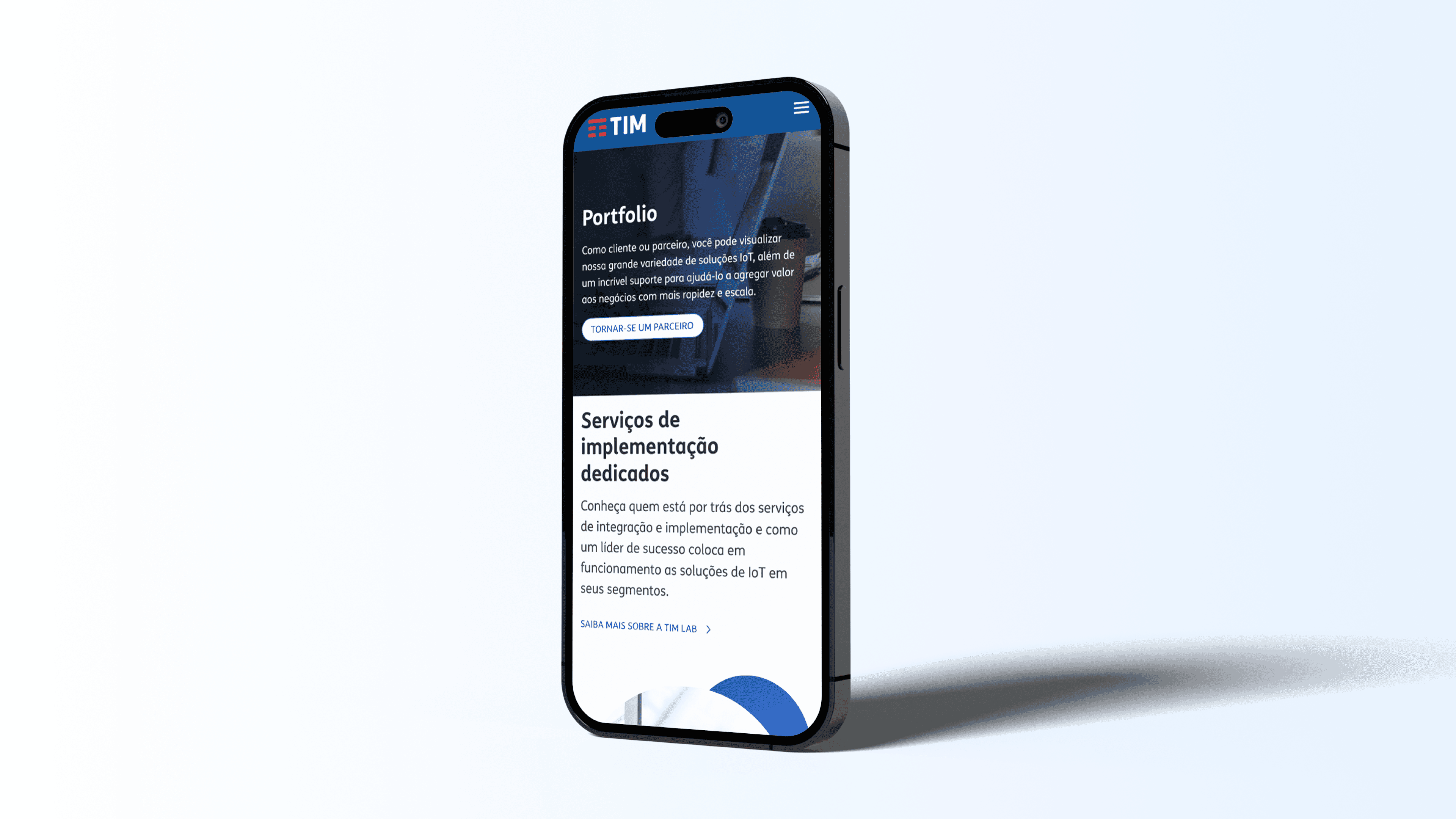
mobile first.
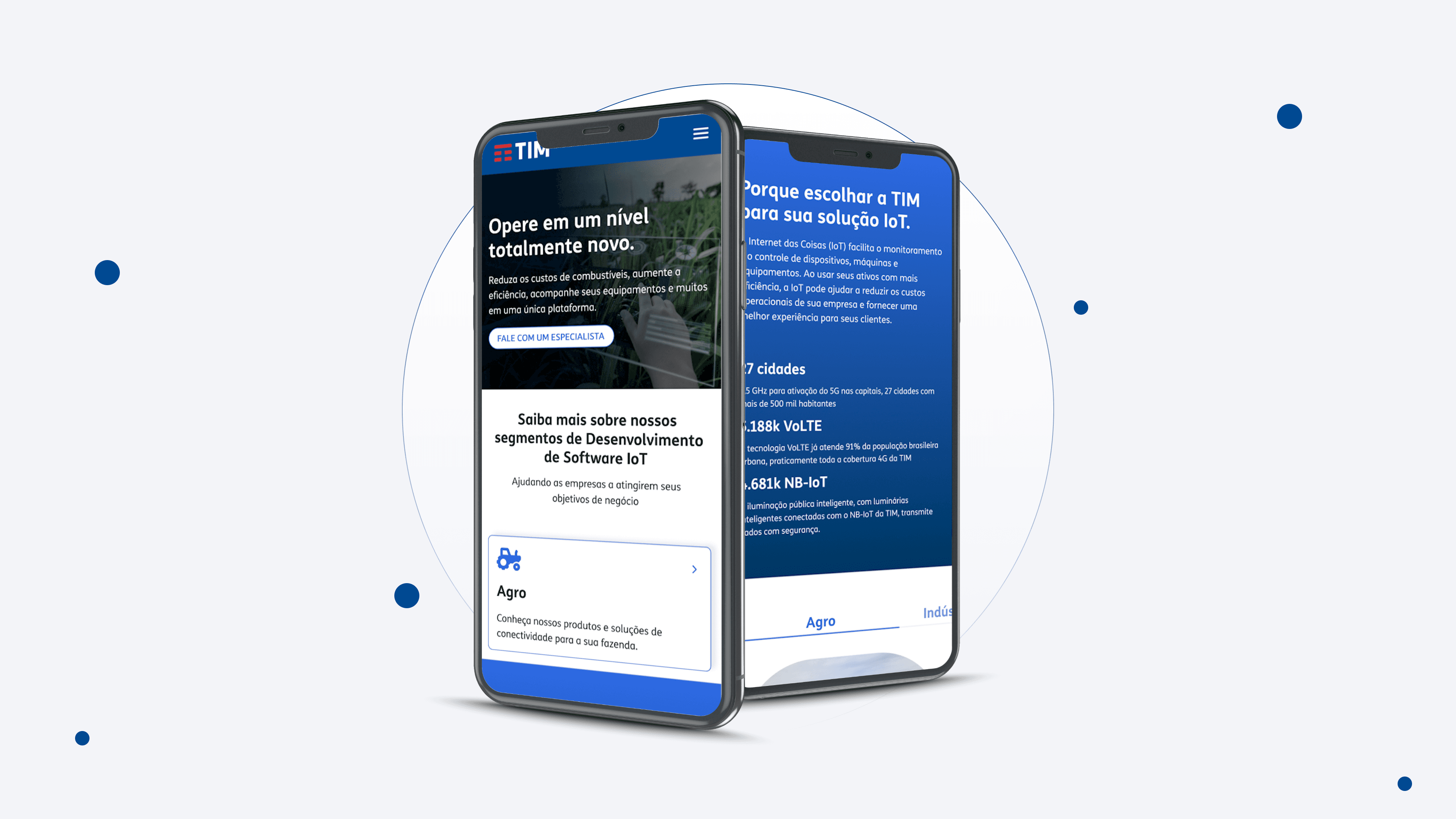
In parallel with the desktop redesign, I placed significant focus on the mobile experience, ensuring the entire platform was responsive and intuitive across all devices. Considering that many potential leads might access the platform via smartphones, crafting a frictionless mobile journey was essential to maximize conversion opportunities. I restructured navigation, optimized touch targets, and simplified content hierarchy to make key solutions and lead capture forms easily accessible on smaller screens. In a lead-generation platform, responsive design isn’t just a usability standard—it’s a strategic tool for engaging users at critical touchpoints and reducing drop-off during the inquiry process.


final thoughts.
The redesigned TIM IoT website was first released in 2022 as a solid MVP, marking a turning point in how the brand presented its B2B tech solutions. From the start, I approached the project with long-term scalability in mind, not only solving the immediate UX problems but also building a flexible design foundation that other designers could easily pick up and evolve. The component-based structure, clarity in documentation, and systematized UI made future iterations smoother and more collaborative.
For me, designing is not just about delivering something functional and beautiful, it’s about anticipating what comes next. I take pride in creating digital products that can grow with the business, adapt to new needs, and be continuously improved by others.
+43 670 400 6306
camaralarissa22@gmail.com