INDUSTRY:

LOGISTICS

CLIENT:

GRUPO MATEUS

YEAR:

2021

TIMELINE

2 MONTHS

Simplifying Access to Grupo Mateus - Maestro’s Internal System

Simplifying Access to Grupo Mateus - Maestro’s Internal System

Simplifying Access to Grupo Mateus - Maestro’s Internal System

Redesigned the mobile onboarding, login, and password recovery flows for a Salesforce-based system — reducing user friction and accelerating access to internal tools.

Redesigned the mobile onboarding, login, and password recovery flows for a Salesforce-based system — reducing user friction and accelerating access to internal tools.

Redesigned the mobile onboarding, login, and password recovery flows for a Salesforce-based system — reducing user friction and accelerating access to internal tools.

project overview.


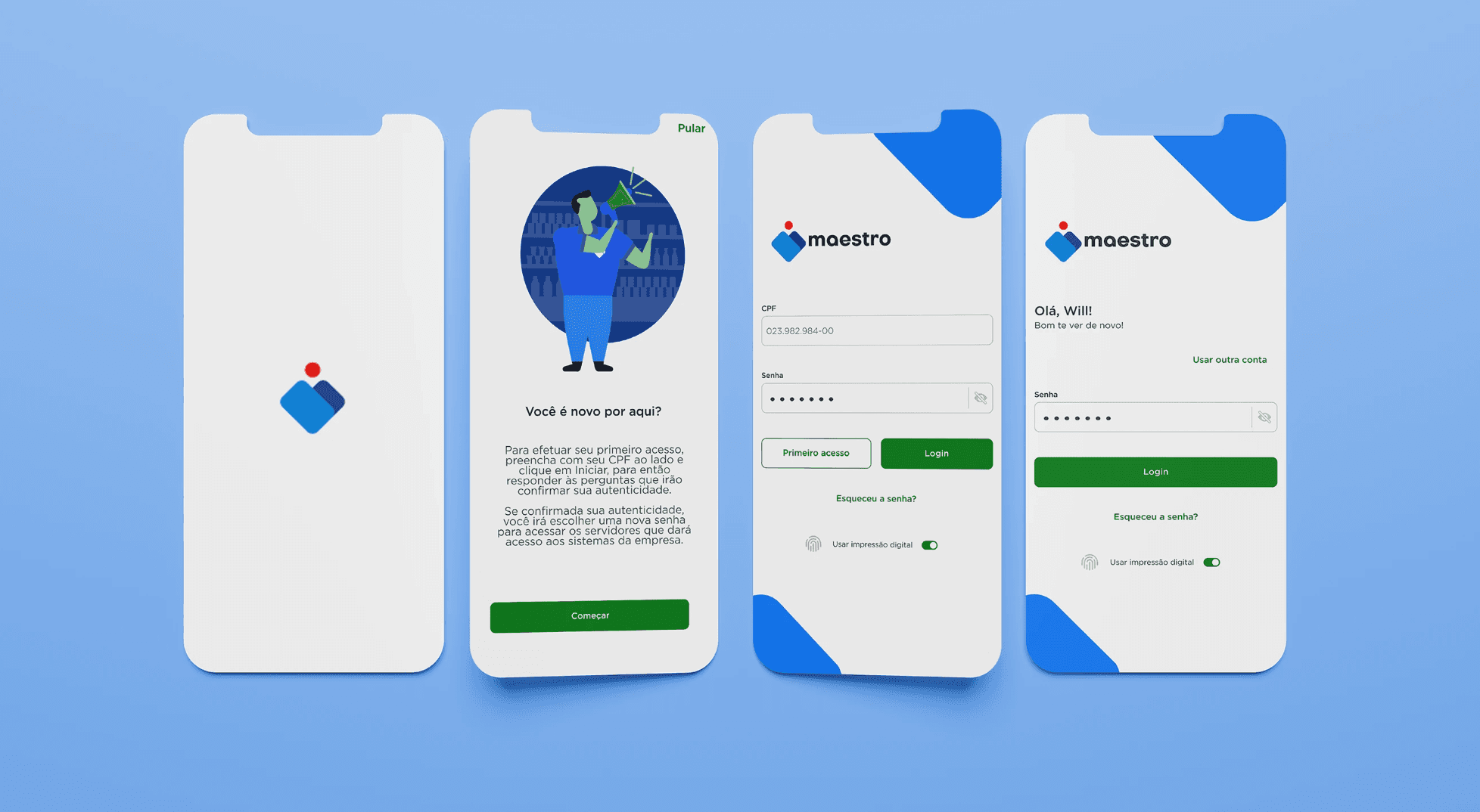
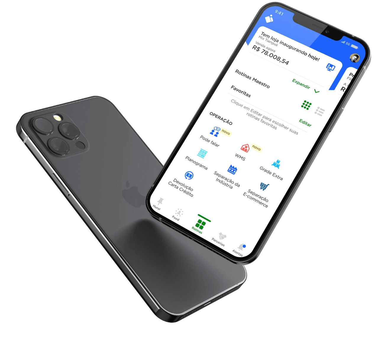
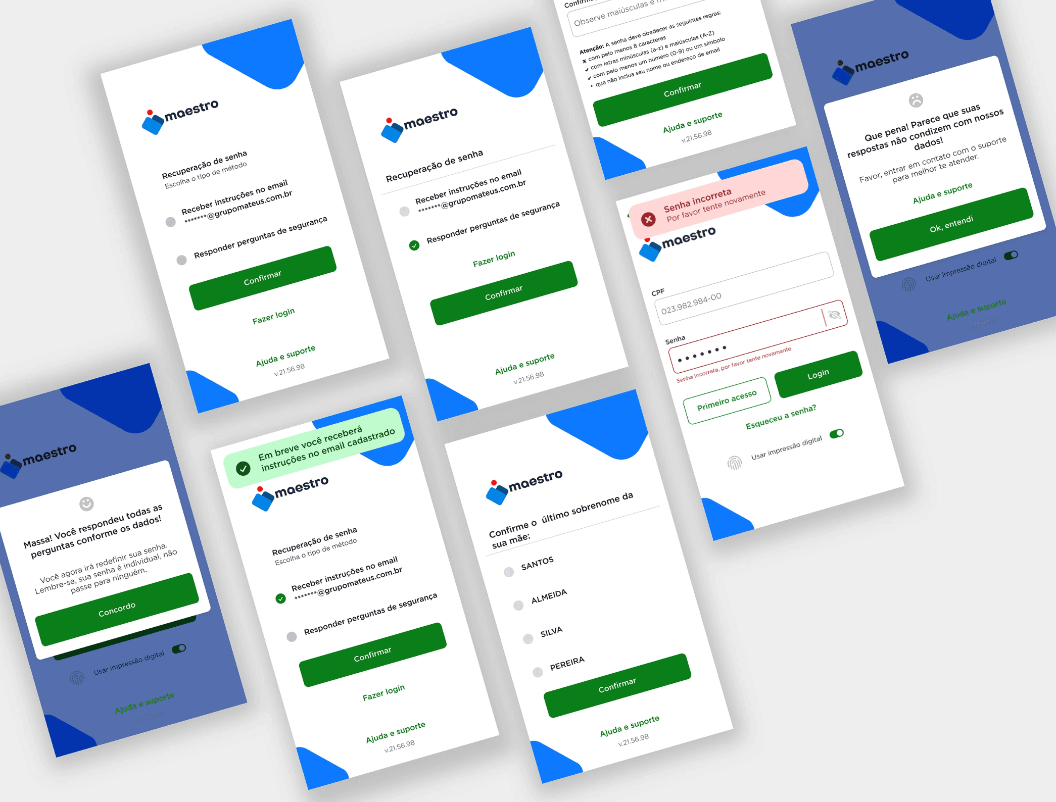
The Maestro mobile application serves as a vital internal tool for Grupo Mateus, one of Brazil’s largest supermarket and logistics networks. However, its original login experience presented a major obstacle: a rigid, desktop-dependent authentication flow that required users to generate temporary access codes via Salesforce, often while they were already in the field or on the sales floor.

The challenge was clear: simplify the login and onboarding experience to reduce friction, respect users' time, and align the system with the dynamic, high-paced environments in which it was being used.


To address this, we redesigned the mobile access journey with a human-centered lens, streamlining first-time access, integrating secure login protocols, and introducing intuitive recovery paths. But more importantly, we grounded our decisions in first-hand research—interviews and direct observation of employees across logistics, export, and retail departments, revealing how the lack of system integration interrupted real-world workflows.


This project wasn’t just about usability, it was about rebuilding trust in a tool meant to support, not slow down, its users.

role & scope.


• UX/UI Design

• User Flow Mapping

• Screen Design for Mobile

• Accessibility Improvements

• Error State Handling

• Collaboration with Salesforce Dev Team

goal.

• Simplify first-time user onboarding

• Reduce user errors and friction during login

• Improve visual clarity and hierarchy across screens

• Design mobile-friendly password recovery paths

flow.


Originally, credentials were manually issued via Salesforce and required users to validate their CPF (Brazilian ID).


This flow was not intuitive and often led to confusion. I restructured the logic into a step-by-step progressive experience, guiding users based on their identification and access level.

login experience.


Users accessed the system infrequently and had difficulty remembering or managing credentials.


I introduced visual cues, clearer input feedback, and accessibility-compliant interactions to improve this experience — especially for users on mobile.

login experience.


Users accessed the system infrequently and had difficulty remembering or managing credentials.


I introduced visual cues, clearer input feedback, and accessibility-compliant interactions to improve this experience — especially for users on mobile.

login experience.


Users accessed the system infrequently and had difficulty remembering or managing credentials.


I introduced visual cues, clearer input feedback, and accessibility-compliant interactions to improve this experience — especially for users on mobile.

password recovery.


Previously complex and tech-heavy, the recovery flow was reimagined with clear options: email validation or security questions.


I also designed fallback states that direct users to support channels when needed.

password recovery.


Previously complex and tech-heavy, the recovery flow was reimagined with clear options: email validation or security questions.


I also designed fallback states that direct users to support channels when needed.

password recovery.


Previously complex and tech-heavy, the recovery flow was reimagined with clear options: email validation or security questions.


I also designed fallback states that direct users to support channels when needed.

ux approach.


• Analyzed the existing Salesforce login logic and observed user pain points during mobile login

• Mapped every possible access and recovery scenario to avoid dead ends

• Designed modular screens using a simple color-coded system, reducing complexity across the UI

• Built logic for visual cues and feedback for invalid fields, failed logins, and empty states.

• Included visual onboarding elements to make the initial experience more approachable

Behind every screen, there’s a decision — and behind every decision, a user.

User Pain Point Analysis
Conducted through stakeholder interviews and analysis of support tickets to uncover where users struggled most (onboarding friction, login confusion, credential management).


Salesforce Logic Review
Mapped technical constraints of how Salesforce handled login/credential flows. Identified gaps between system rules and real user behavior.
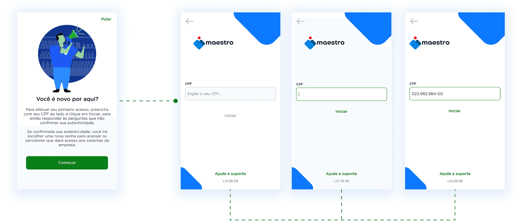

User Flow Mapping
Charted current and ideal user paths for first access, login, and recovery. Focused on edge cases to ensure error prevention.


Access Scenario Trees
Built logic trees for each possible user entry state (new user, forgotten password, institutional login, etc.) to ensure no dead ends.


testing.


Error State Handling
Designed specific visual feedback for invalid inputs, blocked access, and unsupported login attempts.


Validation Options (Email/Security Questions)
Created an accessible fallback system for recovering passwords, with branching logic for mobile-first users.

handoff.

Dev Sync for Salesforce Alignment
Worked closely with developers to ensure logic flows matched backend capabilities, minimizing rework post-delivery.

final takeway.


The Maestro Login redesign tackled a fundamental challenge: fragmented and overly complex login flows that disrupted users’ daily operations. Through interviews and on-site observational research across various departments at Grupo Mateus, a major Brazilian supermarket chain with vast operations in logistics, export, and retail, immersed myself in users’ routines to understand how the login system was affecting real workflows.


One key finding emerged from watching store employees on the ground. In scenarios where they needed to check product availability via the mobile app—often while physically navigating between aisles—they were forced to return to a desktop to generate a temporary Salesforce code just to log in. This disjointed process caused unnecessary frustration, breaking their focus and wasting time. These friction points existed in part because the company was still navigating a digital transformation, where legacy systems had been designed without considering modern user experience principles.


To address this, I prioritized system thinking and seamless UX integration, balancing the current technical constraints with improved usability. By applying Lean UX, an Opportunity Influence Map, and stakeholder alignment early on, we delivered more than a login fix, we created an access strategy tailored to real operational needs.


This project proved that observing people in their natural work environment is just as vital as analyzing screens. The best login experience isn’t just secure and intuitive, it’s invisible when it needs to be and smart enough to work around legacy limitations while paving the way for future improvements.

+43 670 400 6306
camaralarissa22@gmail.com