INDUSTRY:
PRIVATE BANK
CLIENT:
BANCO SOFISA DIRETO
YEAR:
2022
TIMELINE
8 MONTHS

Smart UX, Strategic Value: Engaging High-Profile Investors
Smart UX, Strategic Value: Engaging High-Profile Investors
Smart UX, Strategic Value: Engaging High-Profile Investors
How thoughtful UX decisions helped Banco Sofisa re-engage top-tier investors by turning platform friction into personalized financial value.
How thoughtful UX decisions helped Banco Sofisa re-engage top-tier investors by turning platform friction into personalized financial value.
How thoughtful UX decisions helped Banco Sofisa re-engage top-tier investors by turning platform friction into personalized financial value.
the challenge.
The goal was to understand the needs and expectations of Banco Sofisa Direto’s client base and investment landscape in order to uncover experience gaps and product opportunities. From this analysis, we developed a prioritized roadmap aimed at reducing churn, enhancing long-term engagement, and aligning the platform more closely with the expectations of high-value investors.
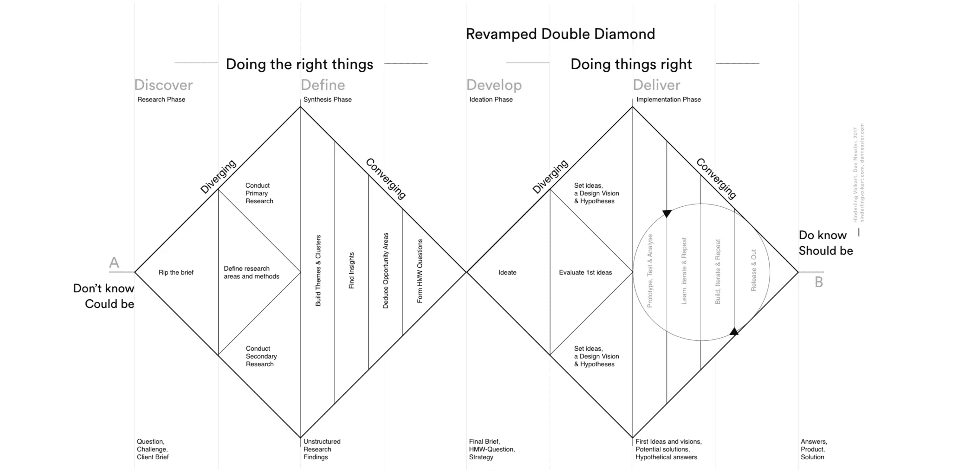
ux process.
This project followed the Double Diamond framework, beginning with an in-depth Discovery phase focused on identifying usability gaps and critical friction points across both the Banco Sofisa Direto website and mobile app.
heuristic evaluation.
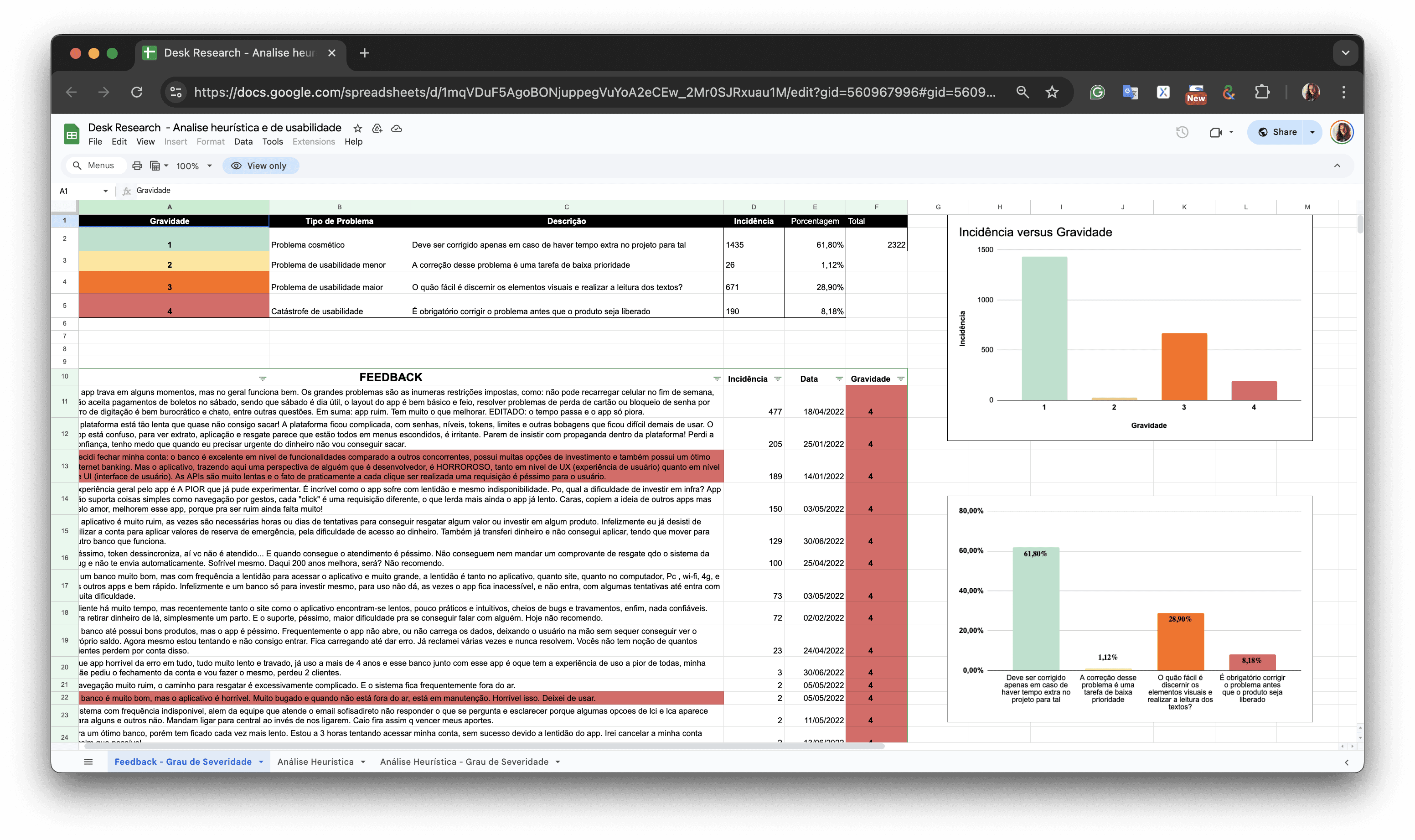
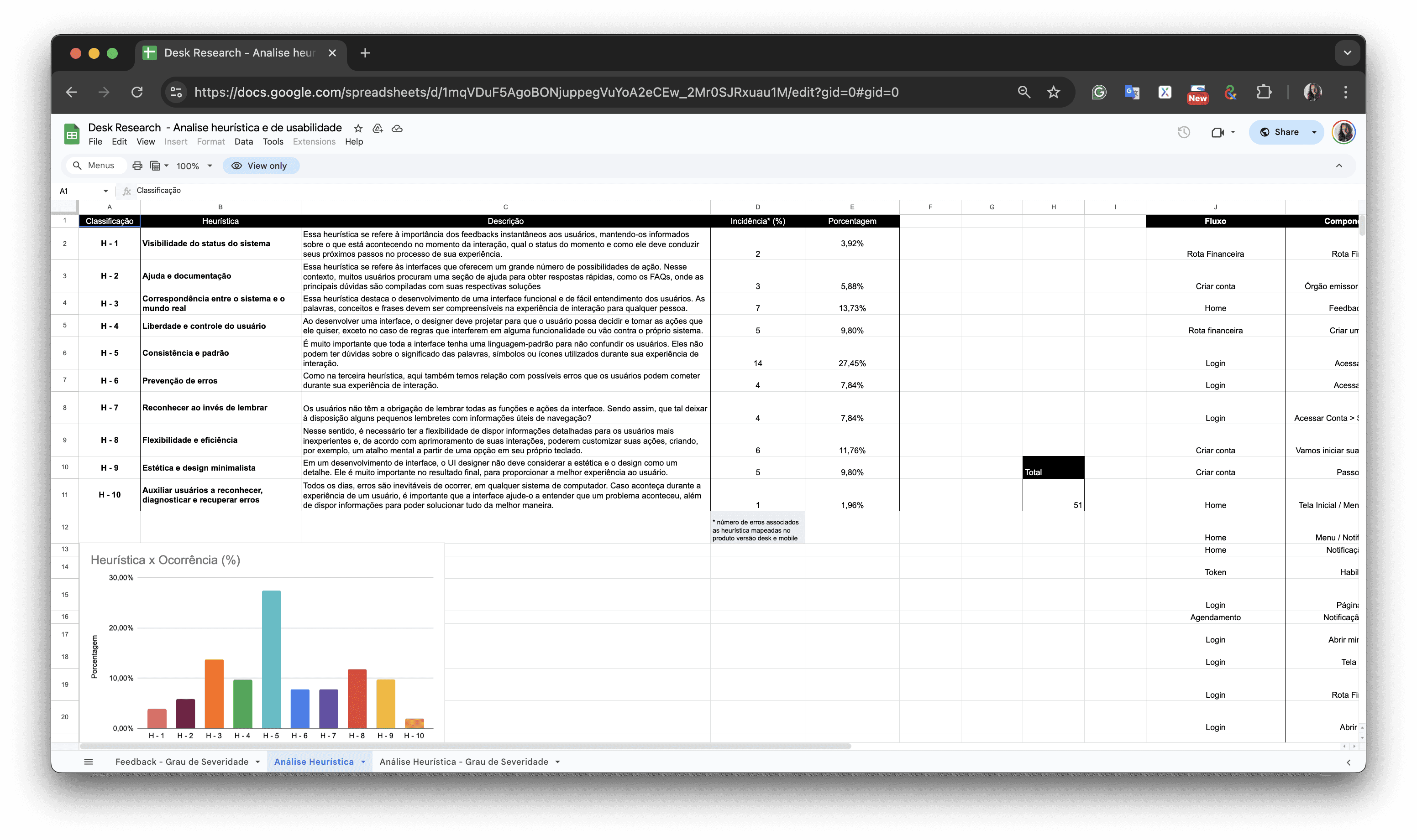
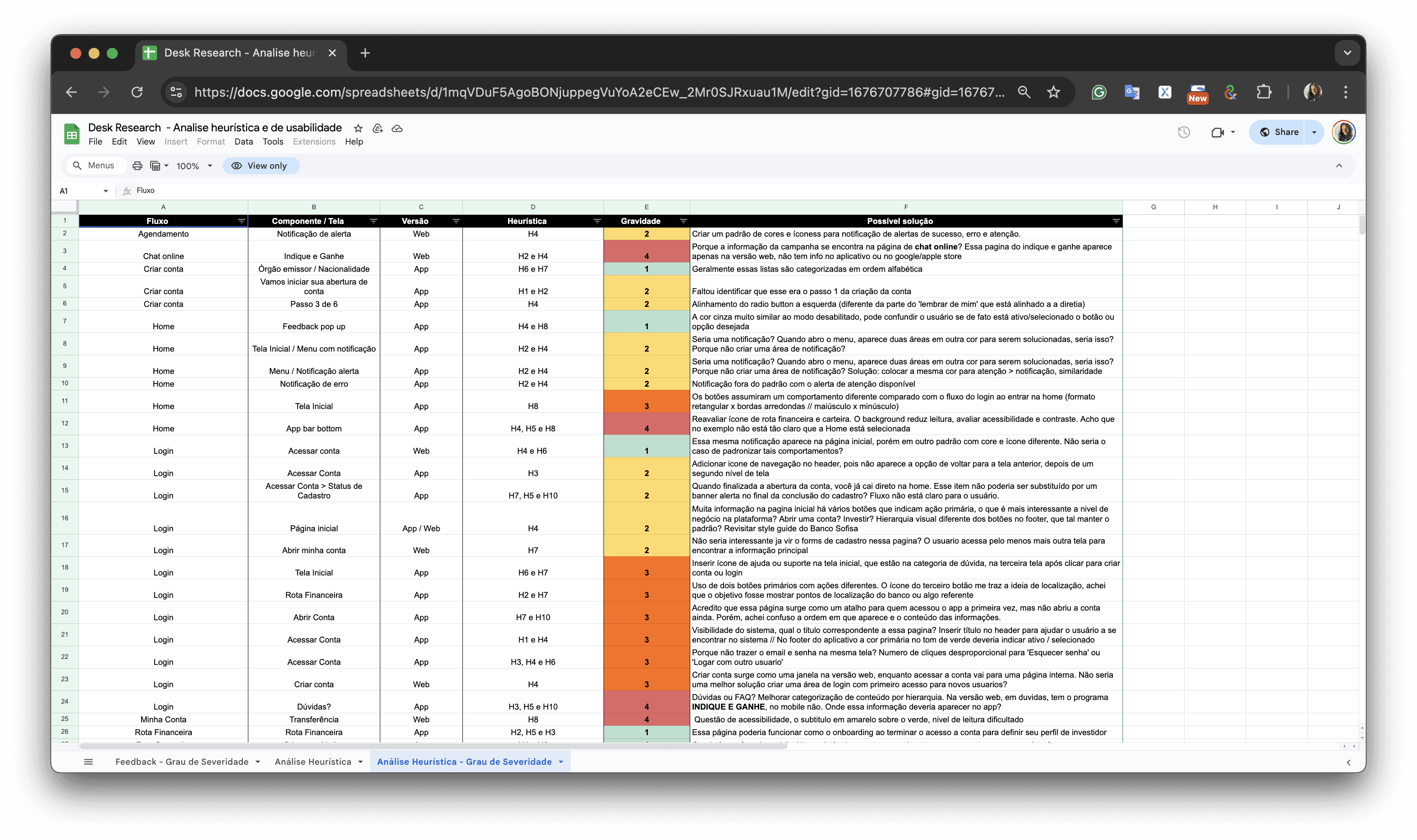
To start, I conducted a heuristic analysis of the core flows — including account opening, applying promotional codes, investing, and redeeming funds. Each issue was categorized by severity: cosmetic problems, minor usability issues, major usability flaws, and critical usability breakdowns. This structured classification allowed our decisions to be grounded in concrete data and aligned with both user impact and business risk.
This helped identify initial pain points and usability violations such as:
• Complex navigation with deep (4-level) hierarchies
• Lack of clear differentiation for high-value customers
• Inconsistencies in UI patterns across different pages/screens
heuristic evaluation.
To start, I conducted a heuristic analysis of the core flows — including account opening, applying promotional codes, investing, and redeeming funds. Each issue was categorized by severity: cosmetic problems, minor usability issues, major usability flaws, and critical usability breakdowns. This structured classification allowed our decisions to be grounded in concrete data and aligned with both user impact and business risk.
This helped identify initial pain points and usability violations such as:
• Complex navigation with deep (4-level) hierarchies
• Lack of clear differentiation for high-value customers
• Inconsistencies in UI patterns across different pages/screens
user feedback analysis.
Mapping this feedback to specific steps in the user journey helped expose not only the reasons behind account abandonment, but also broader usability challenges that were eroding trust and damaging the bank’s value proposition for high-net-worth clients. This research phase laid the foundation for a data-informed roadmap that prioritized technical fixes, UX improvements, and long-term retention strategies.
Feedback collected from:
• Google Reviews
• Android Play Store
• Apple App Store
In parallel, I analyzed user feedback from app stores and public review channels. Many customers expressed frustration around failed account creation attempts, app instability, and the inability to complete or access their investments — often resulting in distrust and churn.
For example:
“I tried several times to open an account and the process failed every time. After waiting so long, it just says the registration couldn’t be completed — and no one could explain why.”
“I’ve been trying to withdraw from a daily liquidity investment for over an hour and the app keeps crashing. It says I have money in my account, but when I try to use it, it says I don’t. It’s a trap — you can’t even access your own funds.”
“The app is extremely slow and doesn’t open. If you can’t invest after opening an account, you’re forced to look elsewhere.”
Feedback was systematically documented and categorized
into an Excel spreadsheet.
Feedback was systematically documented and categorized
into an Excel spreadsheet.
Feedback was systematically documented and categorized
into an Excel spreadsheet.
data organization.
• Bugs (critical functionality issues)
• Feature enhancements (suggested improvements or missing functionalities)
• Cosmetic or structural issues (UI inconsistencies, minor layout problems)
data organization.
• Bugs (critical functionality issues)
• Feature enhancements (suggested improvements or missing functionalities)
• Cosmetic or structural issues (UI inconsistencies, minor layout problems)
data organization.
• Bugs (critical functionality issues)
• Feature enhancements (suggested improvements or missing functionalities)
• Cosmetic or structural issues (UI inconsistencies, minor layout problems)
business analysis.
To uncover why high-value clients — many with over 1.5 million BRL in investments — were disengaging or even closing their accounts, we began with a deep dive into user behavior and segmentation provided by the Product Manager. This data-driven analysis became the foundation for identifying strategic gaps in how the platform was delivering (or failing to deliver) value to different investor profiles.
We discovered three core segments within the high-net-worth audience, each with distinct goals, behaviors, and expectations:
• Conservative Investors — Cautious by nature, they favored low-risk assets like CDBs, government bonds, and other fixed-income products.
• Moderate Investors — Balanced and pragmatic, this group mixed fixed-income investments with diversified funds to seek steady growth while managing risk.
• Aggressive Investors — Risk-tolerant and opportunity-driven, these users actively sought out equities, ETFs, cryptocurrencies, and global assets to maximize returns.
Despite having the right products available, the platform failed to showcase them effectively to each segment. Everyone was seeing the same interface, the same product offers — regardless of their risk appetite or financial behavior. This lack of personalization was a major driver of disengagement. Our business analysis helped frame the challenge not as a product gap, but a UX alignment issue: the right offers were there, but they weren’t reaching the right eyes at the right time.
identifying the right problem to solve.
Once we synthesized the heuristic evaluation with hundreds of user feedback entries from the App Store, Google Play, and direct customer channels, the core issue became clear: it wasn’t about the lack of investment options — it was about how users found them and how the experience made them feel.
Three key pain points stood out:
• Lack of Personalization
High-net-worth users were treated just like everyone else. The platform failed to surface relevant investment opportunities based on user profiles, missing the chance to deepen engagement through intelligent product targeting.
• Overly Complex Navigation
Accessing key features like portfolio details or investment options often required navigating through four or more layers of the interface. This friction disproportionately affected users who expected agility and efficiency — especially those managing large sums.
• No Customization or Saved Preferences
The absence of features like saving investment preferences or tailoring the dashboard to personal needs left users feeling disconnected. The platform lacked adaptability for sophisticated investors who wanted control and speed.
Instead of focusing on superficial fixes, we reframed the problem around experience equity — how to ensure that the most valuable users were also getting the most valuable experience.
discover key finding.
The heart of the research phase, we developed a UX Research Plan to align all stakeholders and define clear goals, metrics, and expectations. Through this structured process, we uncovered a critical insight:
The mobile app — the primary user touchpoint — failed to demonstrate personalized value for high-net-worth individuals.
Despite offering sophisticated investment products, the app presented a one-size-fits-all experience. High-value clients didn’t feel recognized or catered to, which led to dissatisfaction and, ultimately, churn. These users expected tailored recommendations, easier access to premium opportunities, and an interface that acknowledged their specific needs and investment behaviors.
This insight emerged by triangulating:
Heuristic evaluations of the account creation, investment, and withdrawal flows
User reviews and complaints categorized by severity and mapped to app touchpoints
Interviews with key stakeholders and data analysis of user segments and behaviors
By combining qualitative evidence with business metrics, the research plan not only diagnosed the root problem but also gave us direction: to personalize, prioritize, and simplify the app experience for those who matter most.
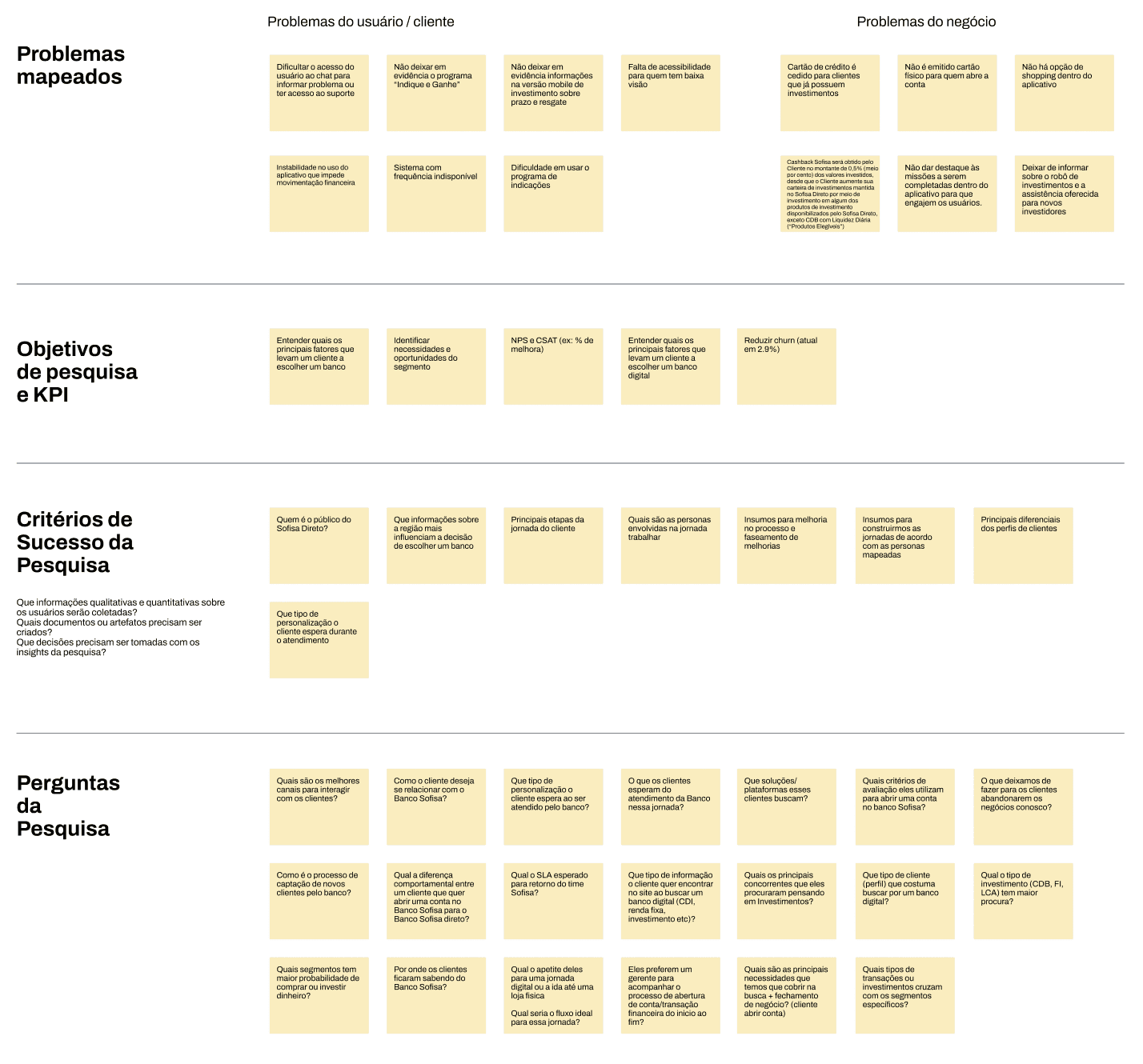
main challenge.
"How might we deliver a personalized, streamlined, and valuable user experience to high-value customers, ensuring they clearly perceive and engage with customized financial products and services?”
main challenge.
"How might we deliver a personalized, streamlined, and valuable user experience to high-value customers, ensuring they clearly perceive and engage with customized financial products and services?”
develop phase.
The redesign was driven by a core goal: to reconnect high-value users with the platform by delivering a tailored experience that matched their expectations and investment behavior. By combining user insights, UX strategy, and behavioral frameworks like Jobs-to-be-Done, we introduced meaningful improvements across the interface and user journey.
Applying the Jobs-to-be-Done (JTBD) approach, we reframed the app’s purpose from a product catalog to an enabler of investment outcomes. We identified that users didn’t just want to “access” investments—they wanted to simplify decision-making and maximize returns with confidence. Personalization and simplification became strategic levers for fulfilling that job, enhancing both user satisfaction and long-term platform loyalty.
Based on the definition of the challenge, targeted UX/UI improvements were developed to address the problems identified:
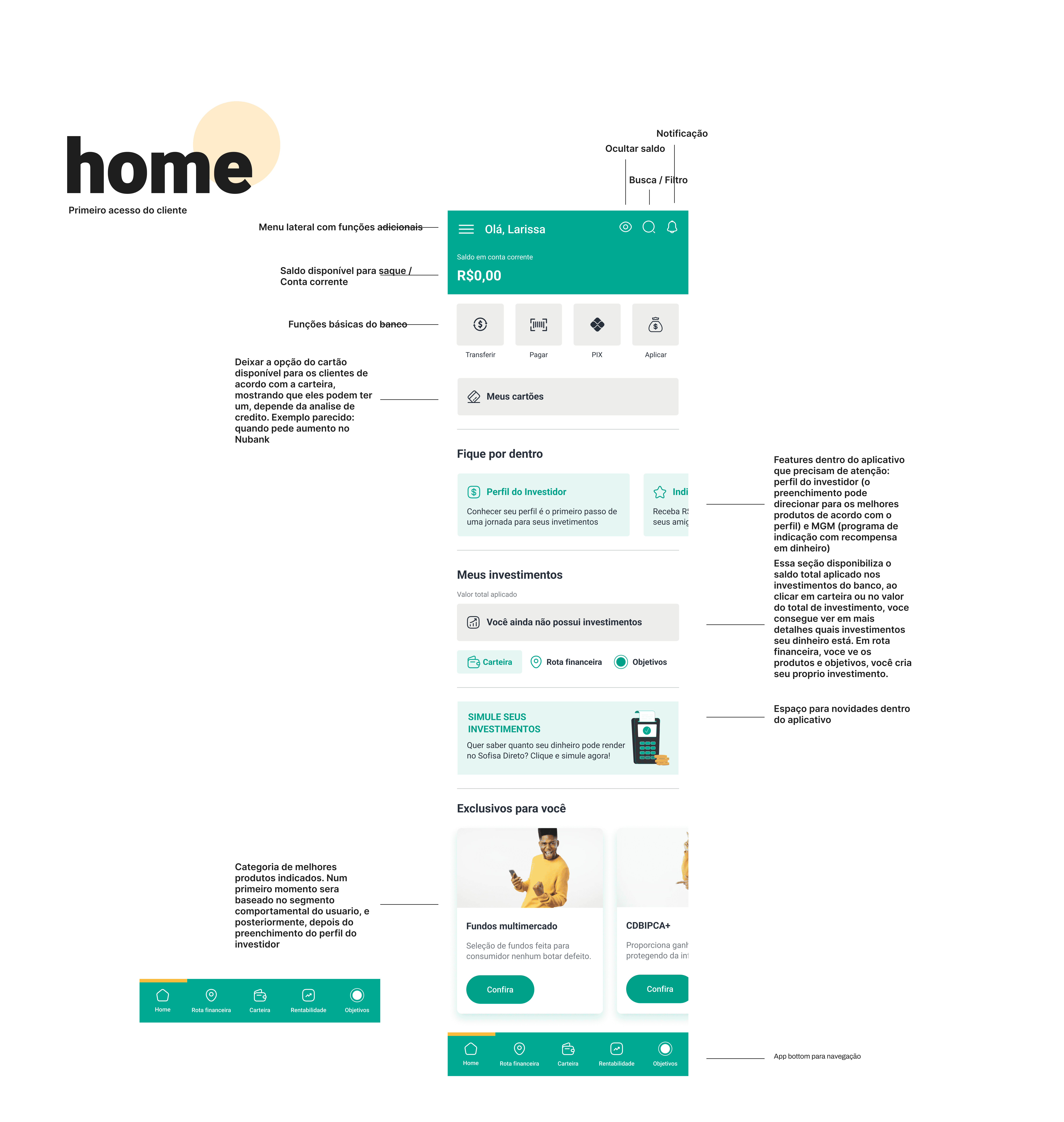
personalized user interface.
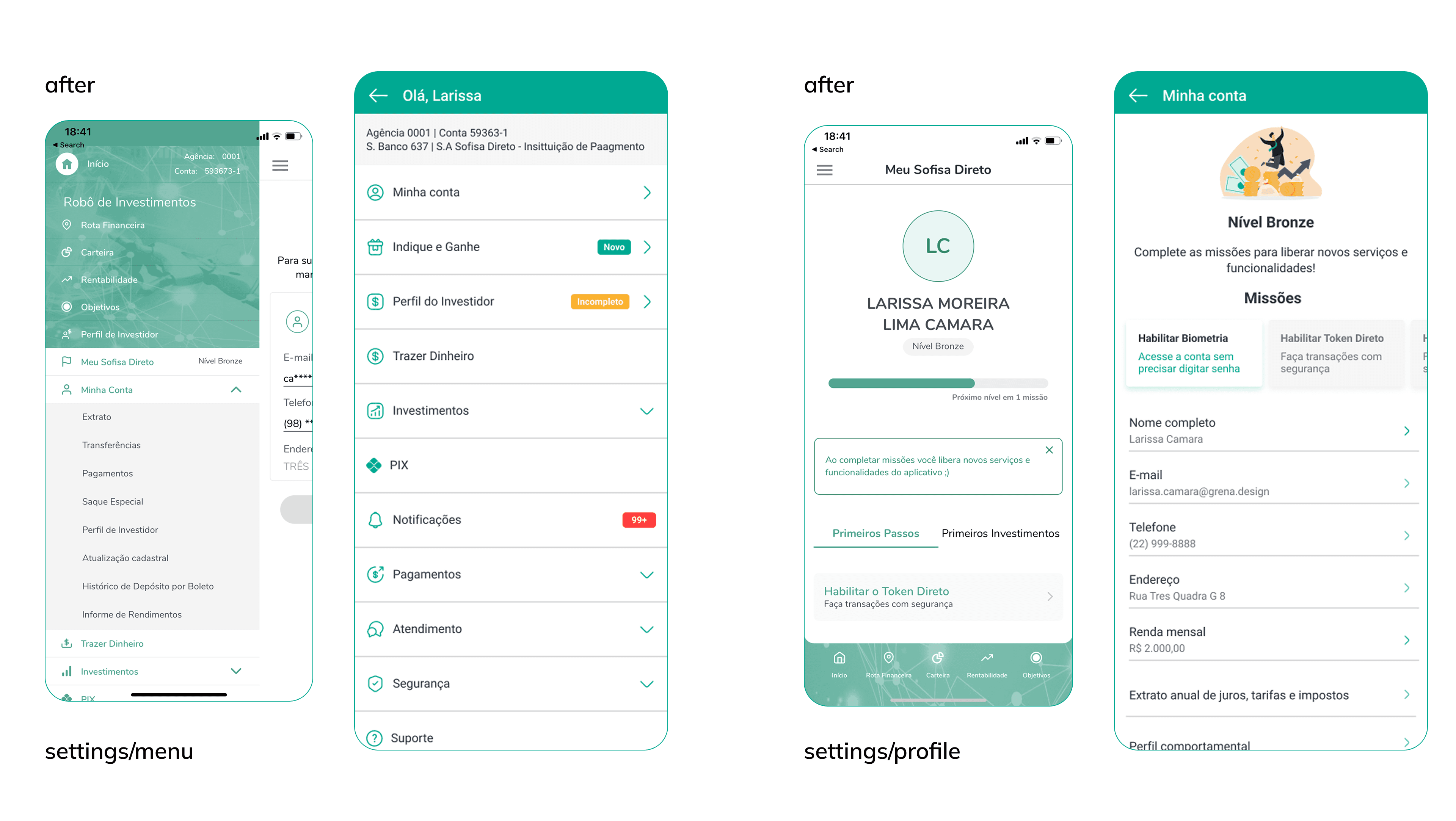
We introduced a dedicated “Recommended for You” section, intelligently positioned and populated based on each user's investment profile—Conservative, Moderate, or Aggressive. This shift moved critical content from buried navigation layers into immediate view, reducing cognitive load and making relevant opportunities visible from the first interaction.
In parallel, we streamlined the entire navigation structure, reducing access from four clicks to two, ensuring users could reach core financial tools without unnecessary friction
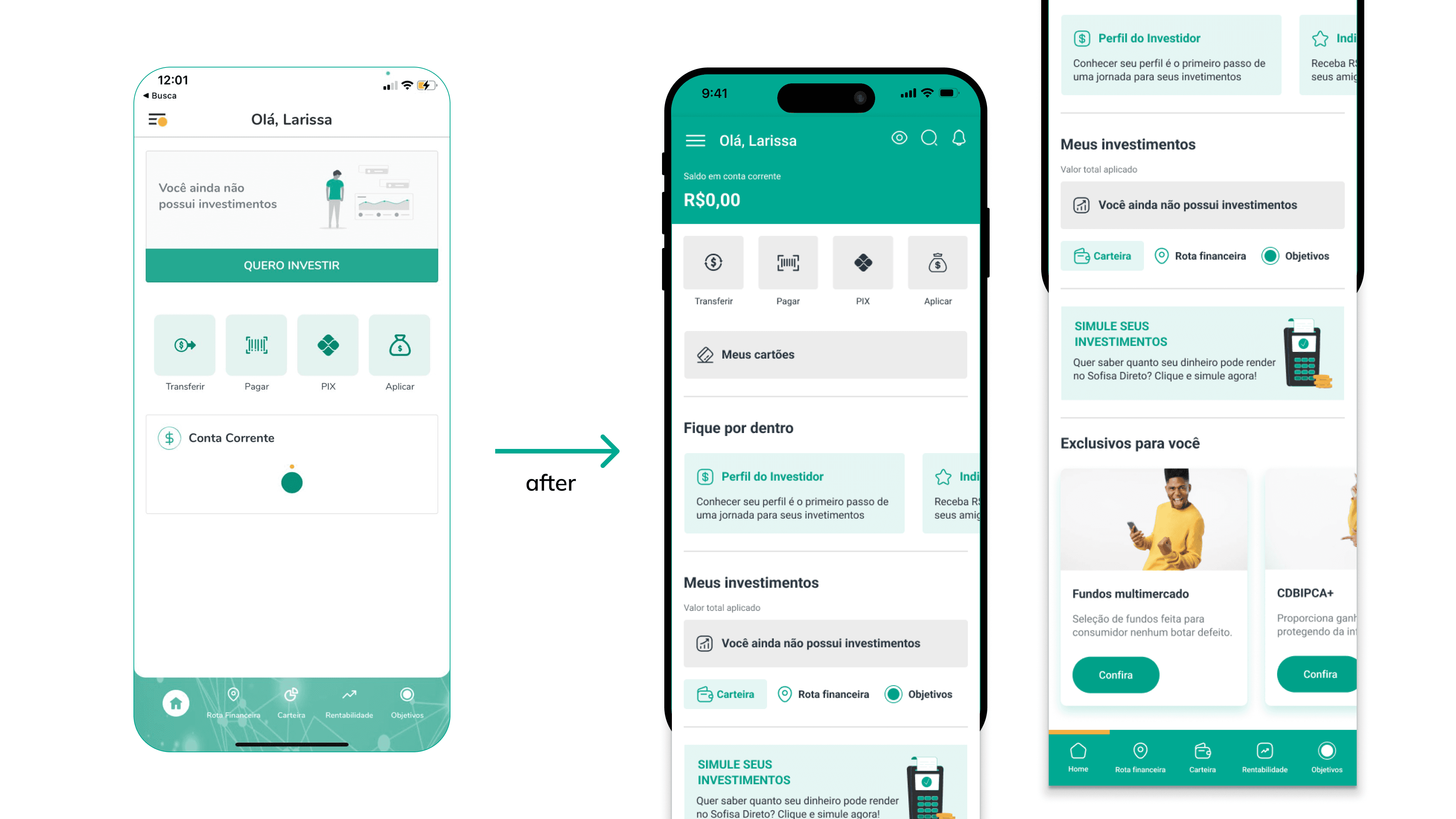
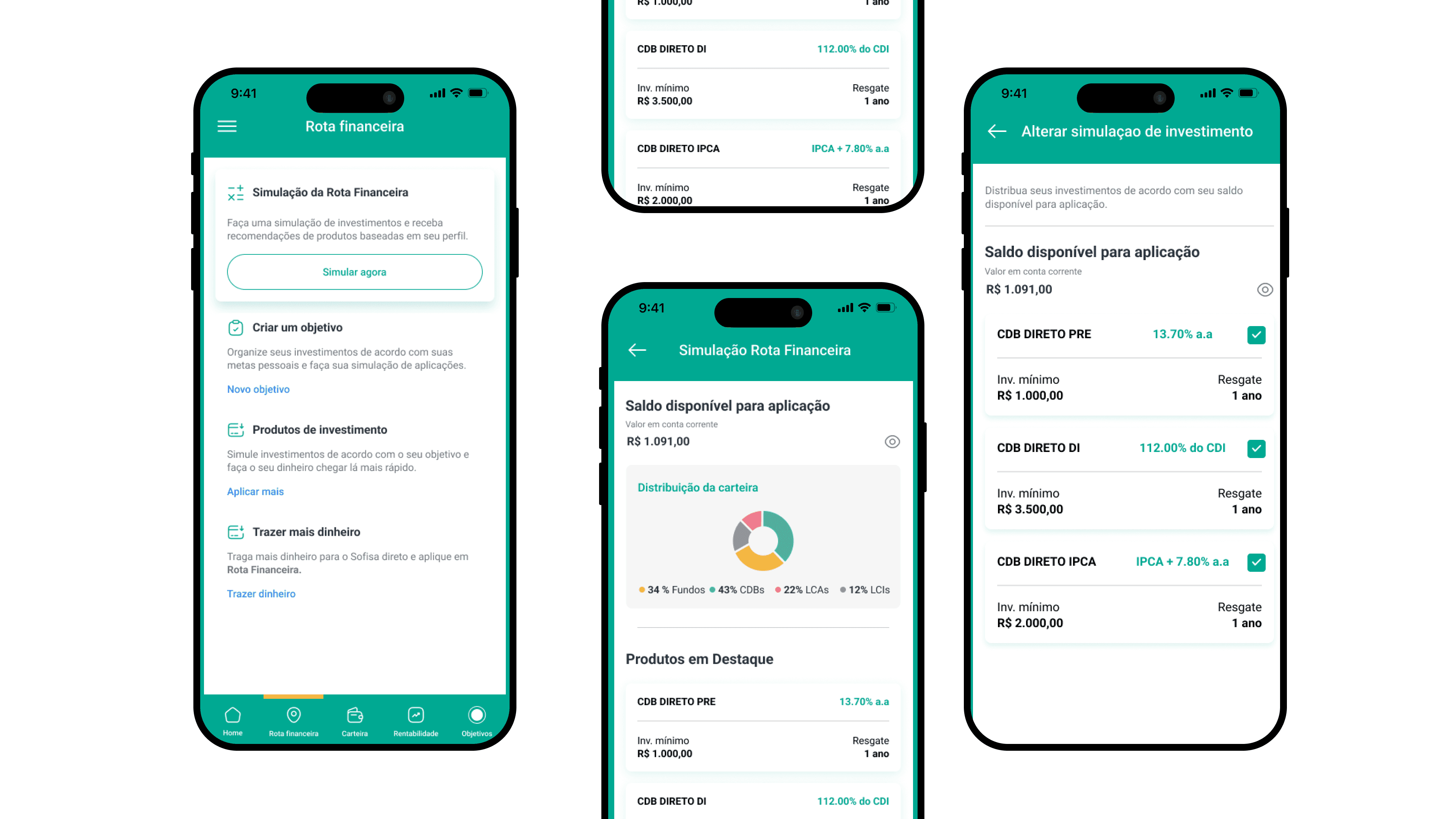
investiment preferences.
To ensure smarter product targeting, we created a customizable investment-preference form. Users could now define their risk appetite, preferred asset types, and portfolio strategies. These preferences were stored in their profiles, enabling the bank to continuously personalize product suggestions and improve conversion rates by meeting users exactly where they are in their investment journey.
develop phase.
The redesign was driven by a core goal: to reconnect high-value users with the platform by delivering a tailored experience that matched their expectations and investment behavior. By combining user insights, UX strategy, and behavioral frameworks like Jobs-to-be-Done, we introduced meaningful improvements across the interface and user journey.
Applying the Jobs-to-be-Done (JTBD) approach, we reframed the app’s purpose from a product catalog to an enabler of investment outcomes. We identified that users didn’t just want to “access” investments—they wanted to simplify decision-making and maximize returns with confidence. Personalization and simplification became strategic levers for fulfilling that job, enhancing both user satisfaction and long-term platform loyalty.
Based on the definition of the challenge, targeted UX/UI improvements were developed to address the problems identified:
personalized user interface.
We introduced a dedicated “Recommended for You” section, intelligently positioned and populated based on each user's investment profile—Conservative, Moderate, or Aggressive. This shift moved critical content from buried navigation layers into immediate view, reducing cognitive load and making relevant opportunities visible from the first interaction.
In parallel, we streamlined the entire navigation structure, reducing access from four clicks to two, ensuring users could reach core financial tools without unnecessary friction
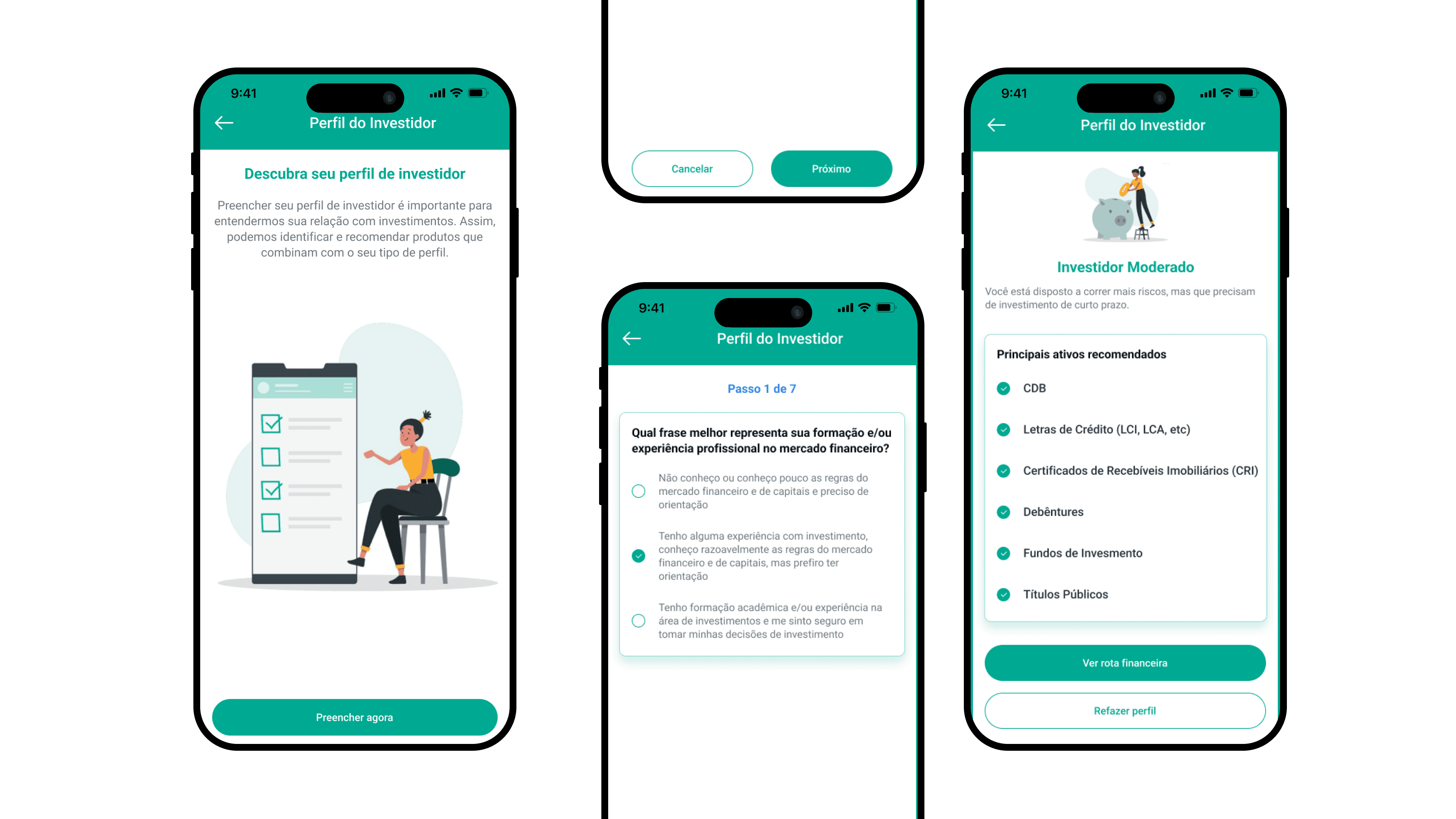
investiment preferences.
To ensure smarter product targeting, we created a customizable investment-preference form. Users could now define their risk appetite, preferred asset types, and portfolio strategies. These preferences were stored in their profiles, enabling the bank to continuously personalize product suggestions and improve conversion rates by meeting users exactly where they are in their investment journey.
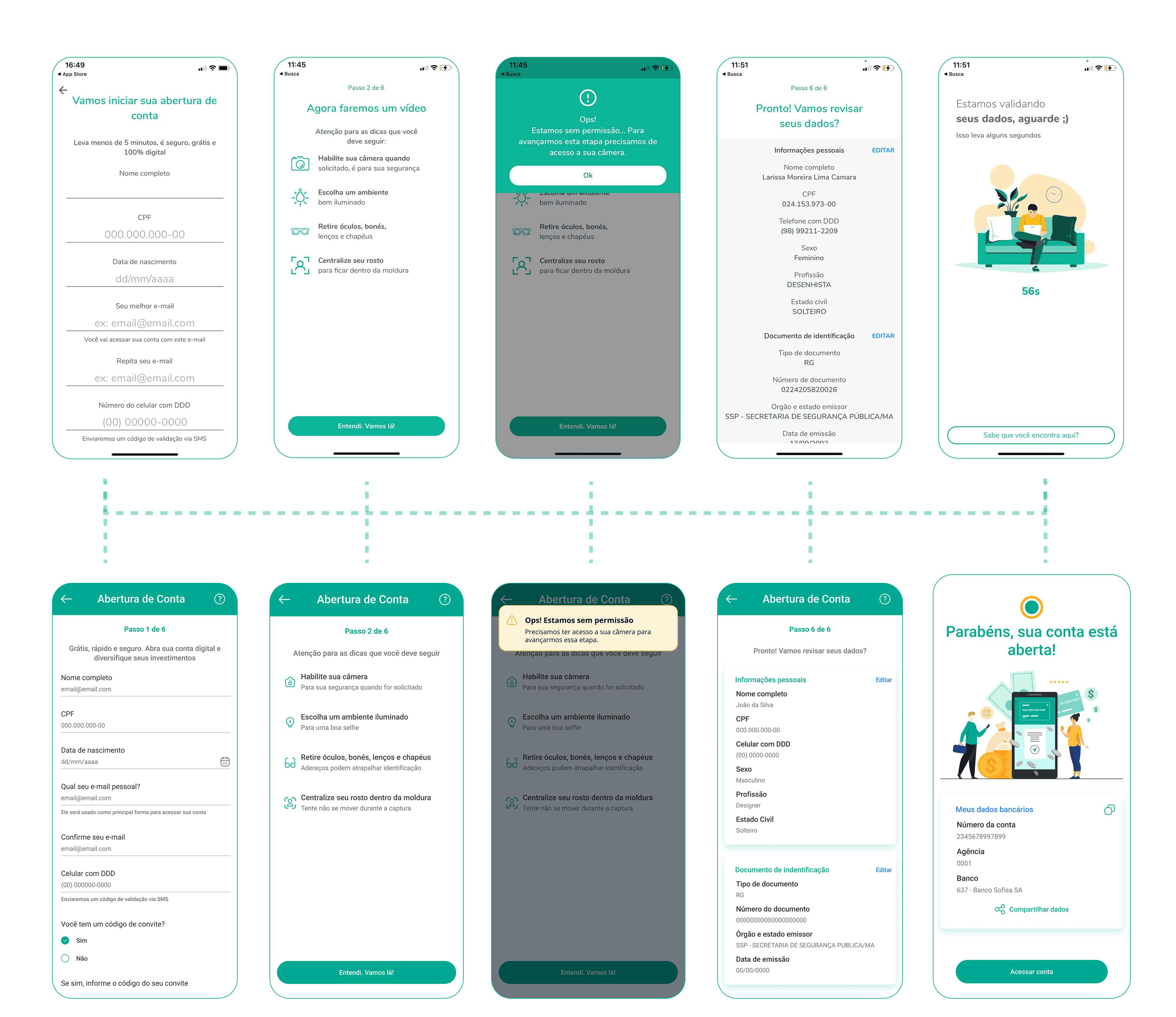
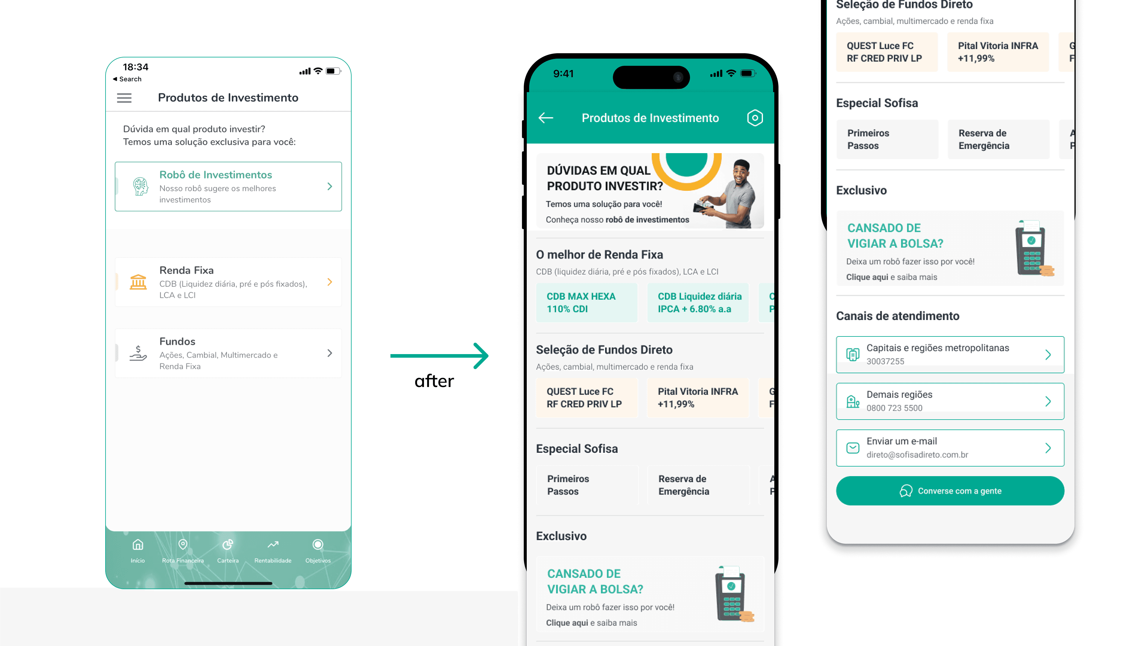
the account openning experience.
While the most critical flow for high-value users was the investment journey itself, the account opening experience remained a vital first impression. It set the tone for trust, credibility, and ease of use. Our research revealed that although this flow marked the user's initial contact with the platform, it was cluttered, inconsistent, and misaligned with user expectations—especially for those coming in with the intent to invest. Improving this entry point was essential to build confidence and reduce early drop-offs
before.
Before the redesign, the onboarding journey suffered from a lack of visual hierarchy, inconsistent UI elements, and messaging that failed to resonate with the investment-oriented audience:
Unclear Progression: Users couldn’t easily tell which step they were in, especially at the beginning of the process. There was no visual indicator or guidance to build confidence.
Weak Communication Strategy: The messaging focused generically on a "digital account" rather than highlighting investment benefits, missing an opportunity to connect with users' intent.
UI Inconsistencies: Input fields lacked alignment and standardization—sometimes left-aligned, sometimes centered—creating visual noise and decision fatigue.
Visual Misalignment: Icons were misaligned and some illustrations broke the visual system, reducing perceived professionalism.
Color Misuse in Alerts: Error or warning messages used incorrect colors, which confused users and sometimes led them to abort the process out of uncertainty.
Redundant Data Entry: Users were asked to input data already captured earlier through document photos, breaking flow and creating unnecessary friction.
Unstructured Information Groups: Form categories lacked separation and visual organization, making it harder for users to understand what belonged where
after.
In the new version, we restructured the journey to reduce friction and increase clarity, while aligning it with the app’s investment-forward identity:
Step-by-Step Progress Tracker: We introduced a visual progress bar that clearly communicates where the user is in the process, reducing abandonment.
Investment-Focused Copy: Content was rewritten to speak directly to the user’s goals—emphasizing returns, access to financial tools, and ease of investment.
Consistent UI Standards: All input fields and elements were aligned and styled using a unified design language, supporting a more intuitive and fluid experience.
Refined Visuals: We established illustration guidelines to harmonize styles and strengthen the app's visual credibility.
Correct Use of Color in Alerts: Visual feedback now follows accessibility standards, making alerts clearer and more informative.
Smart Data Collection: We optimized the flow by minimizing redundant inputs—whenever possible, data is auto-filled or carried forward from earlier steps.
Information Grouping: Sections were reorganized to reflect mental models, making it easier for users to complete steps with confidence.
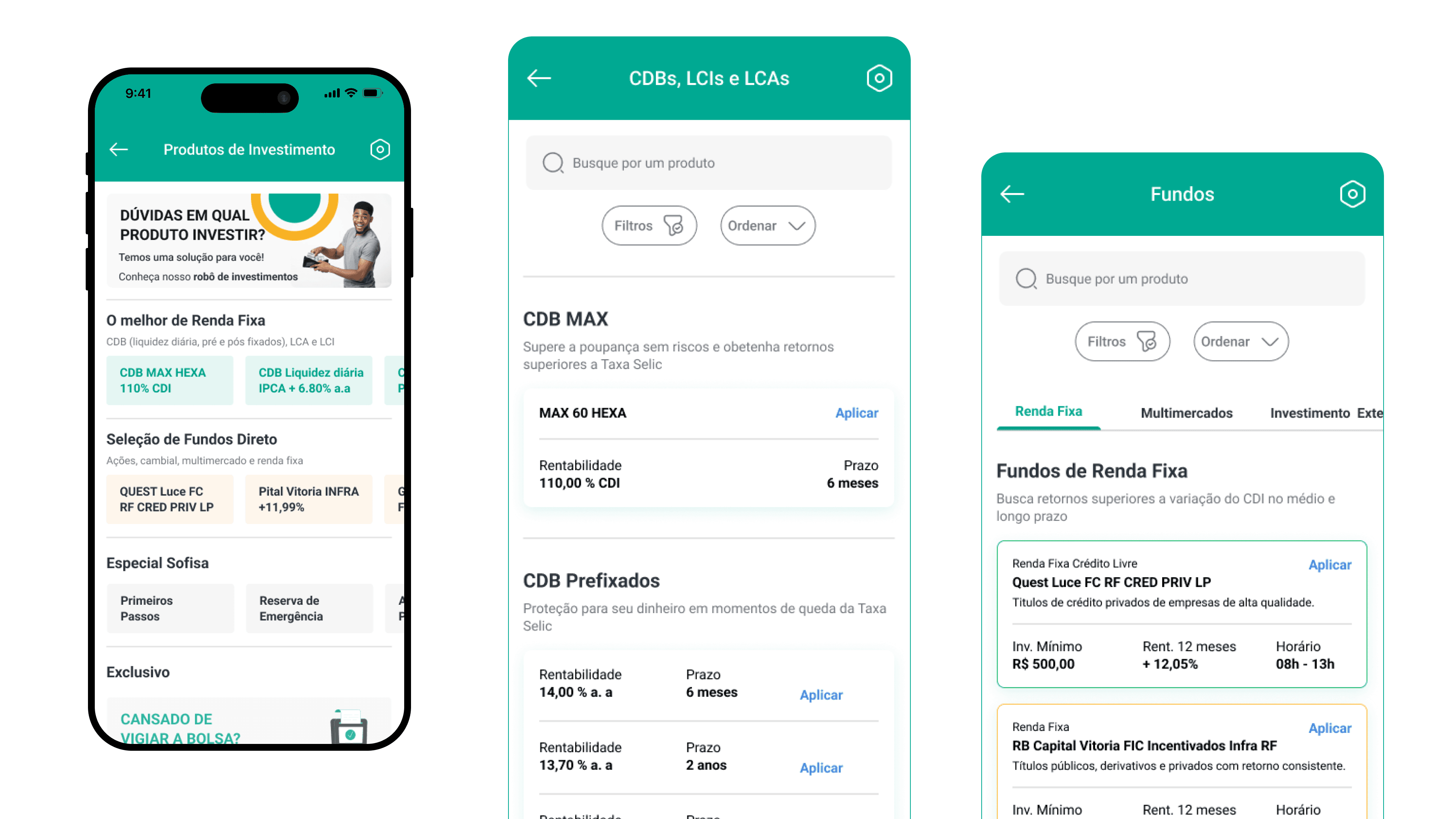
investiment products.
One of the most impactful changes in the redesign was the overhaul of the investment product cards—previously buried in complex navigation and displayed with little visual hierarchy or personalization. These cards represented the heart of the platform’s value, especially for high-net-worth clients, yet were being overlooked or misunderstood due to poor structure, uninspiring content, and inconsistent UI patterns.
By reworking the product cards, we transformed static listings into dynamic, responsive components that communicated key information at a glance: risk level, profitability, duration, and alignment with the user's profile. We introduced clear call-to-actions, standardized iconography, and visual indicators tailored to each investment type, making them more accessible and appealing across devices.
This redesign was directly tied to reducing churn. With the new cards, users could more easily discover suitable opportunities and felt more confident in navigating their options. The clearer presentation and emphasis on relevance shifted the perception of the platform from generic to high-value—and ultimately helped re-engage investors who had previously abandoned the journey due to friction or confusion.
the account openning experience.
While the most critical flow for high-value users was the investment journey itself, the account opening experience remained a vital first impression. It set the tone for trust, credibility, and ease of use. Our research revealed that although this flow marked the user's initial contact with the platform, it was cluttered, inconsistent, and misaligned with user expectations—especially for those coming in with the intent to invest. Improving this entry point was essential to build confidence and reduce early drop-offs
before.
Before the redesign, the onboarding journey suffered from a lack of visual hierarchy, inconsistent UI elements, and messaging that failed to resonate with the investment-oriented audience:
Unclear Progression: Users couldn’t easily tell which step they were in, especially at the beginning of the process. There was no visual indicator or guidance to build confidence.
Weak Communication Strategy: The messaging focused generically on a "digital account" rather than highlighting investment benefits, missing an opportunity to connect with users' intent.
UI Inconsistencies: Input fields lacked alignment and standardization—sometimes left-aligned, sometimes centered—creating visual noise and decision fatigue.
Visual Misalignment: Icons were misaligned and some illustrations broke the visual system, reducing perceived professionalism.
Color Misuse in Alerts: Error or warning messages used incorrect colors, which confused users and sometimes led them to abort the process out of uncertainty.
Redundant Data Entry: Users were asked to input data already captured earlier through document photos, breaking flow and creating unnecessary friction.
Unstructured Information Groups: Form categories lacked separation and visual organization, making it harder for users to understand what belonged where
after.
In the new version, we restructured the journey to reduce friction and increase clarity, while aligning it with the app’s investment-forward identity:
Step-by-Step Progress Tracker: We introduced a visual progress bar that clearly communicates where the user is in the process, reducing abandonment.
Investment-Focused Copy: Content was rewritten to speak directly to the user’s goals—emphasizing returns, access to financial tools, and ease of investment.
Consistent UI Standards: All input fields and elements were aligned and styled using a unified design language, supporting a more intuitive and fluid experience.
Refined Visuals: We established illustration guidelines to harmonize styles and strengthen the app's visual credibility.
Correct Use of Color in Alerts: Visual feedback now follows accessibility standards, making alerts clearer and more informative.
Smart Data Collection: We optimized the flow by minimizing redundant inputs—whenever possible, data is auto-filled or carried forward from earlier steps.
Information Grouping: Sections were reorganized to reflect mental models, making it easier for users to complete steps with confidence.
investiment products.
One of the most impactful changes in the redesign was the overhaul of the investment product cards—previously buried in complex navigation and displayed with little visual hierarchy or personalization. These cards represented the heart of the platform’s value, especially for high-net-worth clients, yet were being overlooked or misunderstood due to poor structure, uninspiring content, and inconsistent UI patterns.
By reworking the product cards, we transformed static listings into dynamic, responsive components that communicated key information at a glance: risk level, profitability, duration, and alignment with the user's profile. We introduced clear call-to-actions, standardized iconography, and visual indicators tailored to each investment type, making them more accessible and appealing across devices.
This redesign was directly tied to reducing churn. With the new cards, users could more easily discover suitable opportunities and felt more confident in navigating their options. The clearer presentation and emphasis on relevance shifted the perception of the platform from generic to high-value—and ultimately helped re-engage investors who had previously abandoned the journey due to friction or confusion.
delivery phase.
With detailed prototype validation and iterative feedback from internal stakeholders, the solutions were finalized:
delivery phase.
With detailed prototype validation and iterative feedback from internal stakeholders, the solutions were finalized:
homepage redesign.
• Direct, quick access to personalized investment recommendations.
• A simplified, clear interface adhering to best UX/UI principles.
product visibility.
• High-value customers immediately see investment opportunities relevant to their profiles.
• Critical investment products presented upfront without needing deep navigation.
insights.
The solution employed the AIDA model (Awareness, Interest, Desire, Action) to optimize users' attention towards recommended investments, thereby increasing engagement and conversion rates among high-value customers.
insights.
The solution employed the AIDA model (Awareness, Interest, Desire, Action) to optimize users' attention towards recommended investments, thereby increasing engagement and conversion rates among high-value customers.
expected outcomes & metrics.
The proposed solutions aimed to deliver quantifiable improvements in:
Increased user retention: By clearly providing personalized experiences.
Higher engagement: Through quicker and more direct access to relevant investment products.
Portfolio growth: Encouraging deeper investment commitment from high-value clients.
expected outcomes & metrics.
The proposed solutions aimed to deliver quantifiable improvements in:
• Increased user retention: By clearly providing personalized experiences.
• Higher engagement: Through quicker and more direct access to relevant investment products.
• Portfolio growth: Encouraging deeper investment commitment from high-value clients.
Metrics proposed to track success include:
• App engagement rates (frequency, session length)
• Conversion rates (product investments)
• Net Promoter Score (NPS) increase among high-value segments
• Reduction of high-value account closures
Metrics proposed to track success include:
App engagement rates (frequency, session length)
Conversion rates (product investments)
Net Promoter Score (NPS) increase among high-value segments
Reduction of high-value account closures
Metrics proposed to track success include:
• App engagement rates (frequency, session length)
• Conversion rates (product investments)
• Net Promoter Score (NPS) increase among high-value segments
• Reduction of high-value account closures

+43 670 400 6306
camaralarissa22@gmail.com
+43 670 400 6306
camaralarissa22@gmail.com
delivery phase.
With detailed prototype validation and iterative feedback from internal stakeholders, the solutions were finalized:
homepage redesign.
• Direct, quick access to personalized investment recommendations.
• A simplified, clear interface adhering to best UX/UI principles.
product visibility.
• High-value customers immediately see investment opportunities relevant to their profiles.
• Critical investment products presented upfront without needing deep navigation.
insights.
The solution employed the AIDA model (Awareness, Interest, Desire, Action) to optimize users' attention towards recommended investments, thereby increasing engagement and conversion rates among high-value customers.