INDUSTRY:
LOGISTICS
CLIENT:
GRUPO MATEUS
YEAR:
2020
TIMELINE
8 MONTHS
project overview.
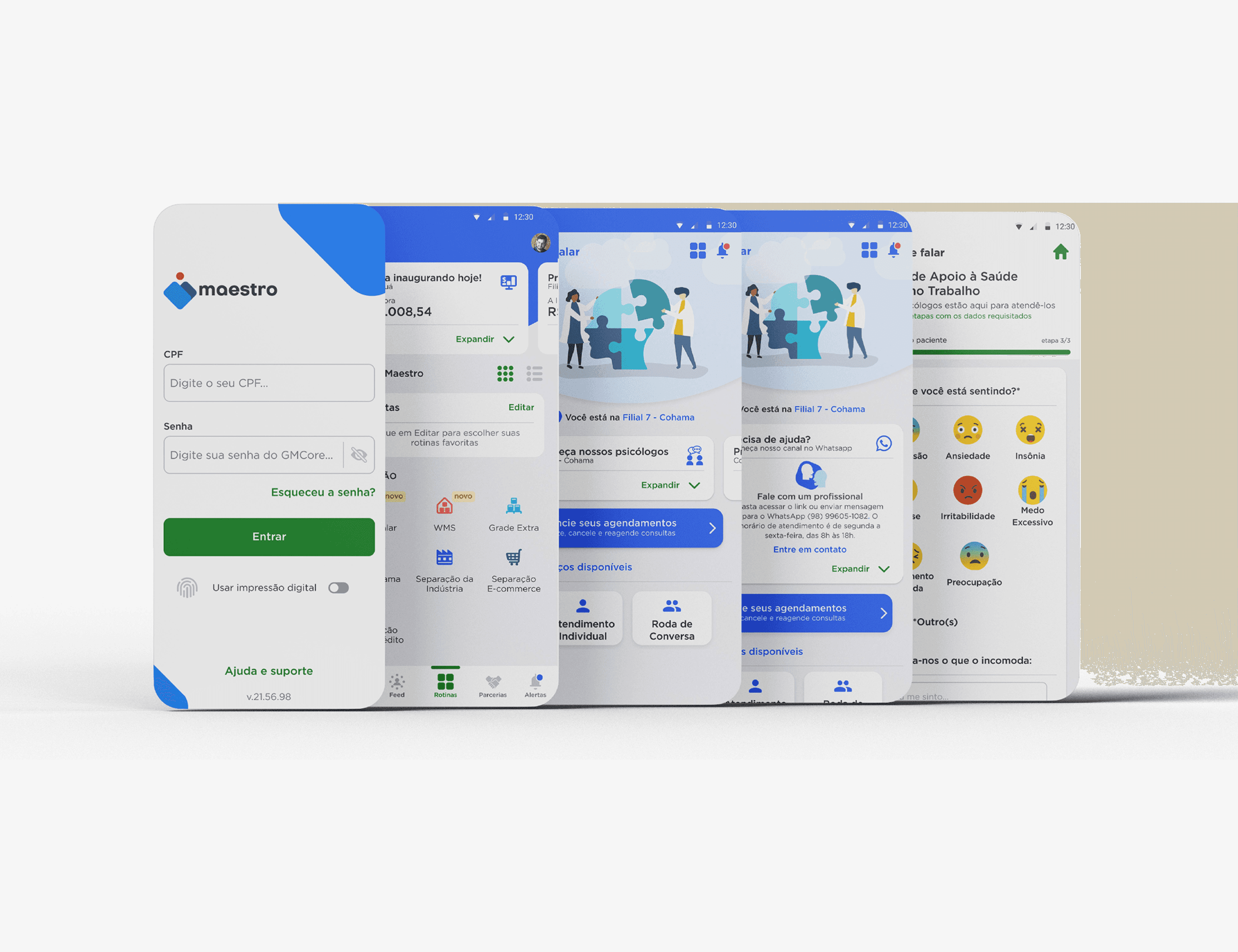
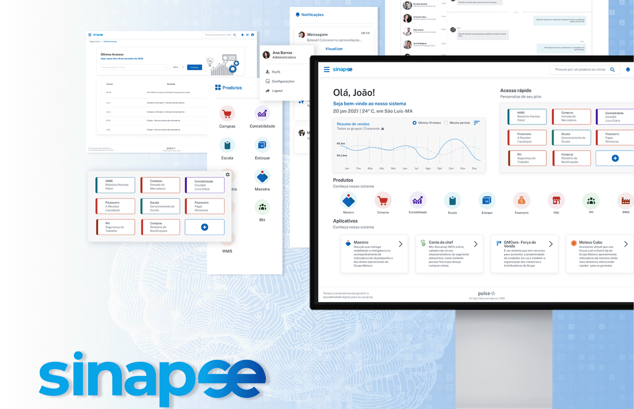
As part of Grupo Mateus’s broader digital transformation, the Sinapse ERP redesign aimed to modernize and humanize the internal platform used daily by employees across departments—from logistics and inventory to finance and administration. My role was to lead the development of the new interface, focusing on improving usability, system clarity, and task efficiency.
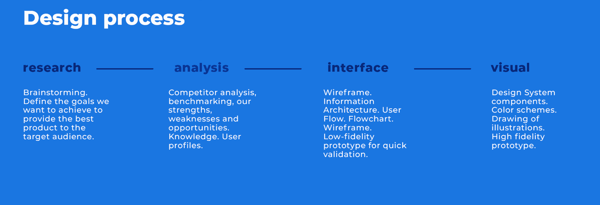
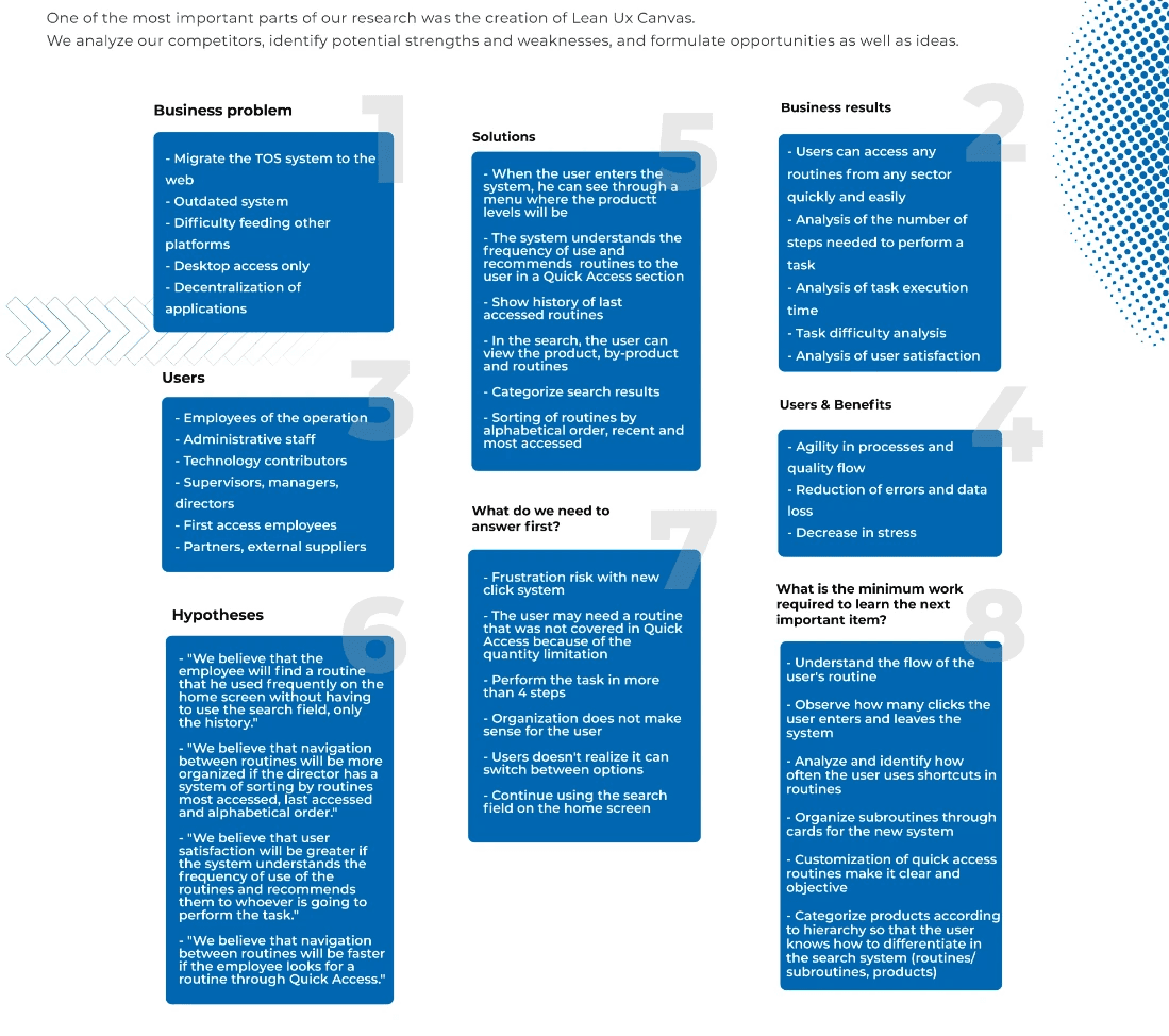
To kick off the project, I conducted a reverse engineering process to fully understand the existing platform. This meant diving deep into its structure, workflows, and features, while observing how different teams interacted with it in their daily routines. I mapped user journeys, ran interviews with employees from various departments, and identified key usability issues and friction points. These insights helped form the foundation for a user-centered redesign.
Working from an early style guide, I began shaping a cohesive UI system that evolved into a full design system for Grupo Mateus. The redesigned interface emphasized modularity, responsiveness (including mobile support), and improved navigation, helping users complete tasks faster and with less cognitive load.
objectives.
• Redesign the interface for intuitive access to key modules and tasks
• Reduce time spent finding and executing common routines
• Unify visual language across screens and device types
• Make the system more accessible to non-technical users
• Integrate quick access tools based on usage patterns
role & scope.
• UX Research
• Competitive & Heuristic Analysis
• Persona Development
• Interface & Design
• High-Fidelity Prototyping
• System Usability Testing
• Design System Library Creation


reflection.
Working on Sinapse taught me a lot about designing for real-life complexity. The system had to serve many roles and workflows, and my decisions needed to balance structure, clarity, and empathy. Every small detail mattered, from how people logged in with their CPF to how easily they could move through the interface without getting stuck.
The handoff phase had its own layers of complexity. The design system was not fully in place, so I started documenting components and tokens as we built them. Different teams were developing parallel products, so keeping everything aligned took time and care. Still, even with a gradual rollout, the foundation we built allowed others to scale the work later on. Looking back, I see this project as a turning point — not just in my career, but also in how design started playing a stronger role inside the organization.