INDUSTRY:

MULTINATIONAL BREWING

CLIENT:

ANHEUSER-BUSCH INBEV SA/NV.

YEAR:

2021

TIMELINE

6 MONTHS

Designing a Global CMS Experience for Corona
& AB-InBev Brands

Designing a Global CMS Experience for Corona
& AB-InBev Brands

Designing a Global CMS Experience for Corona & AB-InBev Brands

Designing modular, localized websites that bring Corona’s global brand to life.

Designing modular, localized websites that bring Corona’s global brand to life.

kick off.

Since 2021, Corona has been reshaping its global identity — moving beyond beer to become a true lifestyle brand. Through strategic expansion into D2C sales, merchandising, travel, retail, and immersive experiences, the brand began to offer more than just a product — it started delivering moments and meaning.


This project kicked off with the bold ambition to unify Corona’s digital presence across all markets. The challenge was to build a scalable, CMS-driven platform that ensured consistency in visual identity and user experience, while still giving local teams the flexibility to adapt content, language, and activations.

task.

My role was to support the creation of a templated global website framework for the Corona brand — one that would be scalable, visually consistent, and adaptable to local market needs. Beyond UX strategy, I was also responsible for crafting the graphic/UI components of the platform, ensuring alignment with Corona’s brand identity and global design standards.

The main goals included:

  • Establishing a standardized look and feel across all international markets

  • Enabling flexibility for local teams to translate, adapt, and update content easily

  • Collaborating with a global team to define a centralized process for always-on content management, performance tracking, and ongoing design improvements

website content pillars.

The new Corona platform was designed to include a wide variety of touchpoints for consumers and creators alike:


🍺Beer & Merchandise eCommerce

🚀 Product & Innovation

📣 Campaign Pages

🎥 Video Content Hub

📝 Articles / Blog

🌅 Sunsets Festivals

website content pillars.

The new Corona platform was designed to include a wide variety of touchpoints for consumers and creators alike:


🍺Beer & Merchandise eCommerce

🚀 Product & Innovation

📣 Campaign Pages

🎥 Video Content Hub

📝 Articles / Blog

🌅 Sunsets Festivals

🏝️ Vista Corona Booking

🌱 Sustainability Initiatives

📖 About the Brand

📲 Links to Social Media / Live Social Feed

🔐 Creator Hub (private access)

📜 Legal Elements (privacy, terms, responsible consumption)

website content pillars.

The new Corona platform was designed to include a wide variety of touchpoints for consumers and creators alike:


🍺Beer & Merchandise eCommerce

🚀 Product & Innovation

📣 Campaign Pages

🎥 Video Content Hub

📝 Articles / Blog

🌅 Sunsets Festivals


🏝️ Vista Corona Booking

🌱 Sustainability Initiatives

📖 About the Brand

📲 Links to Social Media / Live Social Feed

🔐 Creator Hub (private access)

📜 Legal Elements (privacy, terms, responsible consumption)


🏝️ Vista Corona Booking

🌱 Sustainability Initiatives

📖 About the Brand

📲 Links to Social Media / Live Social Feed

🔐 Creator Hub (private access)

📜 Legal Elements (privacy, terms, responsible consumption)

approaches.

To deliver a seamless global experience, we focused on three foundational pillars: UX consistency, data integrity, and scalable eCommerce. A unified visual identity was essential to ensure that the site looked and felt like “Corona” everywhere in the world. This meant staying true to the brand’s established visual language while adapting flexibly to local content needs. Equally important was maintaining a consistent data structure, enabling smooth, multi-market operations, centralized analytics, and clean user journeys regardless of location.


For the e-commerce flow, two distinct paths were designed: one for beer, which redirects users to local fulfillment systems due to regulatory variances; and another for merchandise, where two approaches were considered: either redirecting to localized stores or managing inventory centrally through a global P&L.

These decisions impacted not just logistics, but also customer support, marketing operations, and platform hosting.


In terms of customer relationship management (CRM), Salesforce was selected to host records, supporting global outreach through scalable email and SMS campaigns under a cost-per-send model. We also implemented testing and personalization tools to optimize user journeys and target media effectively based on local and global behavioral data. Search engine optimization (SEO) and search engine marketing (SEM) were continuously refined to enhance discoverability and elevate conversion rates throughout the user journey.


Finally, we ensured flexibility for new content updates and campaign launches through modular UX components, allowing our team to deploy new homepages or create new sections on demand, supporting a truly “always-on” content strategy.

lean ux canvas.

When managing a global project with multiple stakeholders—ranging from local marketers in São Paulo to product leads in Amsterdam and legal teams in Mexico City—one of the greatest challenges is building a shared understanding of the problem space and goals. To address this early on, we introduced the Lean UX Canvas as a central tool during our strategy sessions and workshops.

The Lean UX Canvas helped the team align on business outcomes, user problems, solution ideas, and hypotheses without getting bogged down in lengthy documentation. Instead of siloed goals from each branch, this format fostered real-time collaboration, surfacing potential conflicts, duplicate ideas, or mismatched priorities before they became blockers.

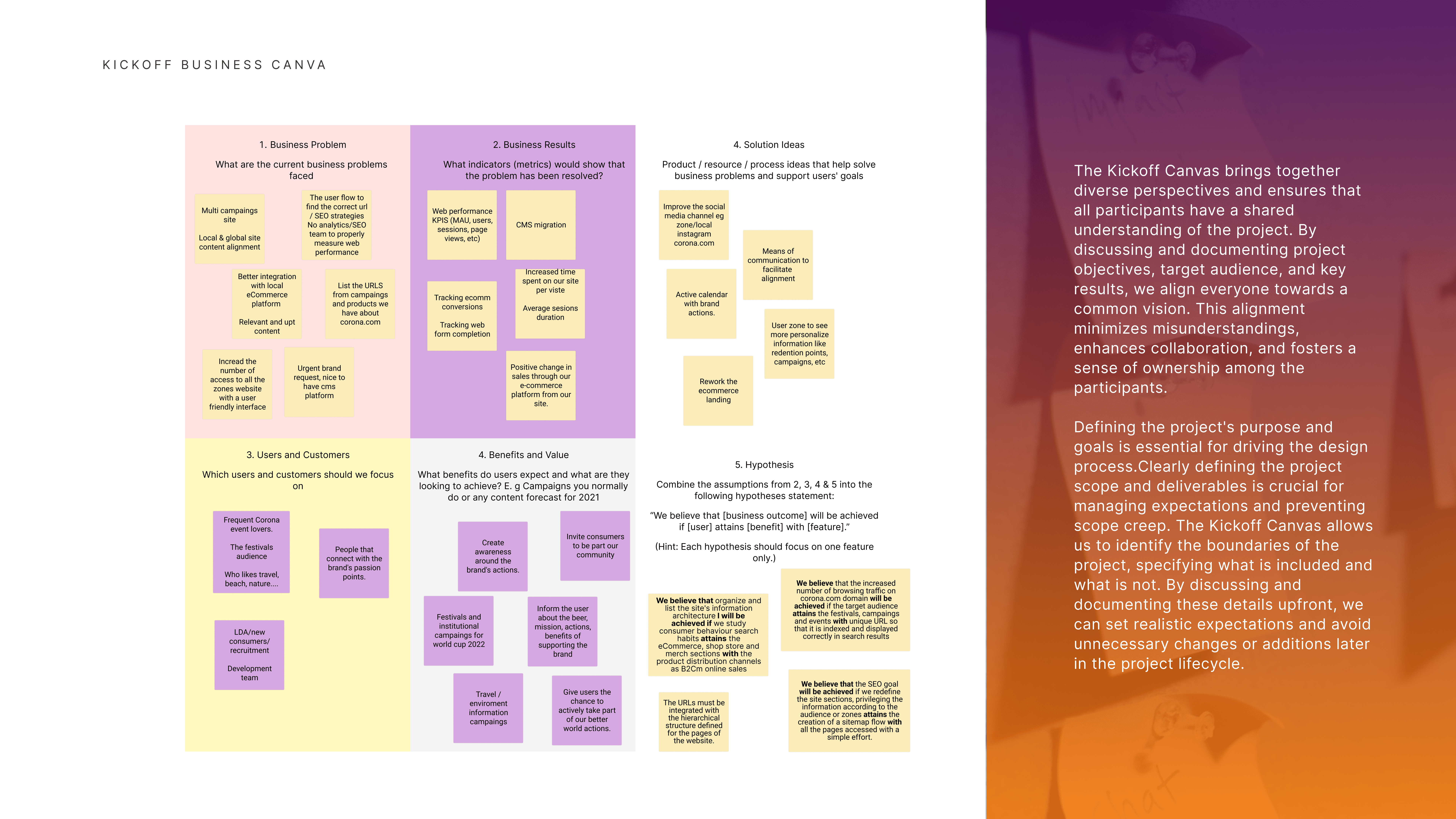
In this project, the canvas acted as a north star: clarifying why we were building this ecosystem, who we were solving for, and what success would look like across vastly different markets. It allowed global and local teams to speak the same language—balancing Corona’s brand consistency with the unique cultural nuances each country needed to reflect.


By keeping this canvas visible and editable throughout the project, it became a living document that helped us drive decisions fast, validate assumptions through research, and stay focused on user-centered outcomes. It was especially useful in organizing MVP priorities for the August launch, managing expectations, and establishing a shared rhythm for the September rollout and continuous optimization work that followed.

design & scalability.

The UI direction took direct inspiration from Corona’s global visual brand identity: open skies, golden hour gradients, airy compositions, and a lifestyle anchored in nature, community, and calmness. We used this foundation to create a design system that was both expressive and functional—balancing the emotional appeal of beachside festivals with the structural rigor needed for eCommerce flows, campaign launches, and content hubs.

Each module—whether it was for a product launch, booking page, or sustainability initiative—was designed using a templated component library.


This allowed for flexibility in local adaptations (like languages and imagery) while keeping visual consistency in layout, spacing, color use, and typography.

We optimized interactions for both desktop and mobile environments, ensuring that animations, transitions, and micro-interactions aligned with the easygoing, intuitive experience Corona wanted users to feel.

We also made sure the design served performance goals: optimized loading times, intuitive navigation patterns, and lightweight components for international users. Accessibility was baked into the system early on, with contrast ratios, scalable typography, and simplified forms supporting a smooth experience for all.


Ultimately, the UI wasn't just about looking good—it became a cohesive visual framework that tied together all product layers: from booking a sunset event in Chile to browsing a beer campaign in Italy. It was one global voice, expressed through multiple local stories—sun-soaked, optimistic, and unmistakably Corona.

look & feel.

When designing a website for a summer festival in South America, it's important to capture the vibrant and energetic atmosphere of the event.

Choosing a vibrant and lively color scheme that reflects the spirit of summer and the festival. Bright and warm colors like shades of orange, yellow, and red can evoke a sense of energy and enthusiasm. Additionally, incorporating colors commonly associated with South American culture, such as turquoise or tropical greens, can help create a visual connection to the region.

from insight to impact.


The Corona Sunsets Festival project was more than a website, it was a digital embodiment of a lifestyle, a global stage where music, nature, and human connection converge. From aligning stakeholders across continents to designing a flexible, scalable system, every step was driven by the intention to deliver consistency without losing authenticity.

+43 670 400 6306
camaralarissa22@gmail.com

+43 670 400 6306
camaralarissa22@gmail.com